A family business beside the train.
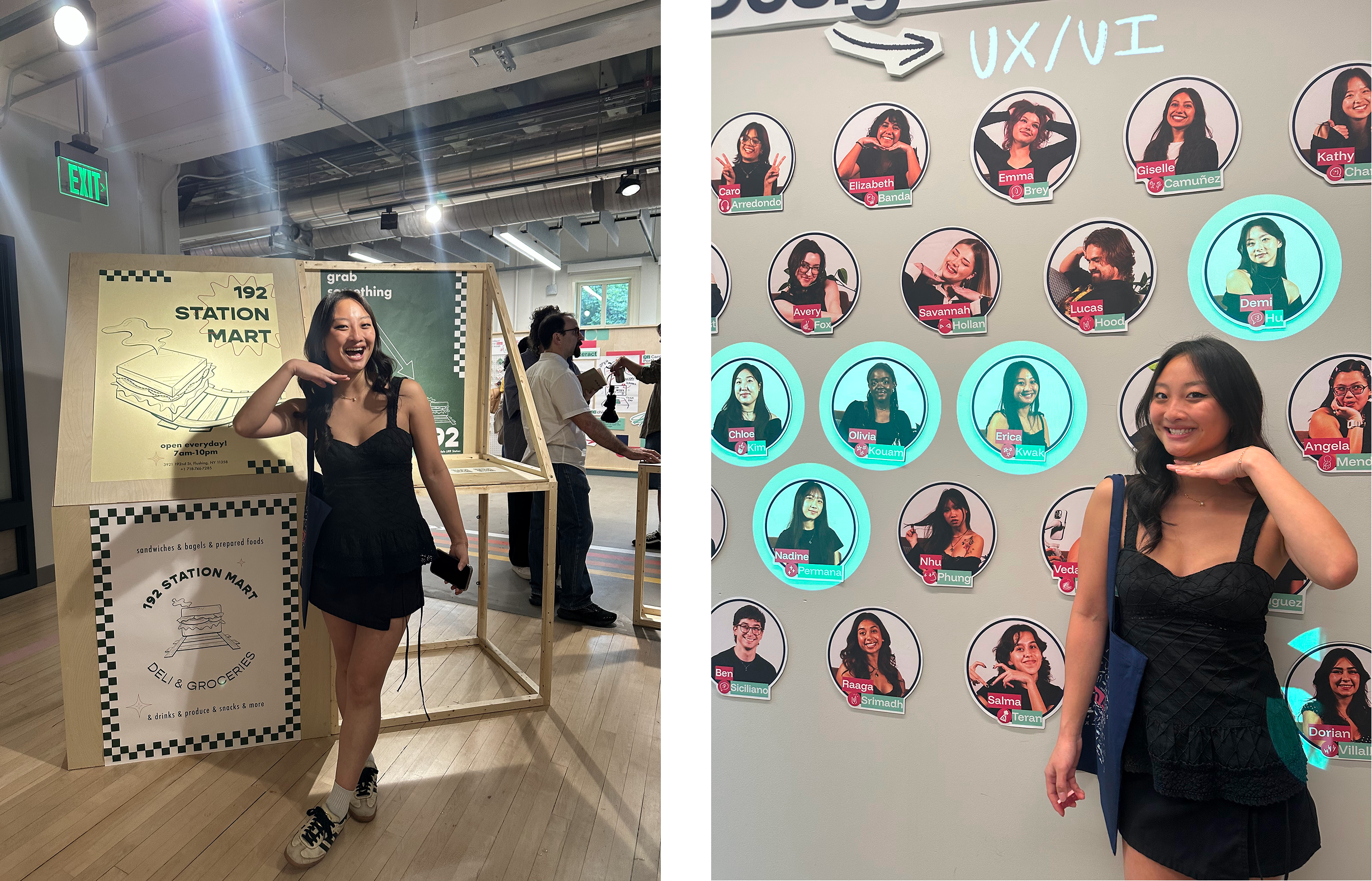
192 Station Mart is a high-traffic bodega in Auburndale, NY, owned and operated by my parents. Situated directly beside the Long Island Rail Road (LIRR) station, the store is a critical pitstop for morning commuters.
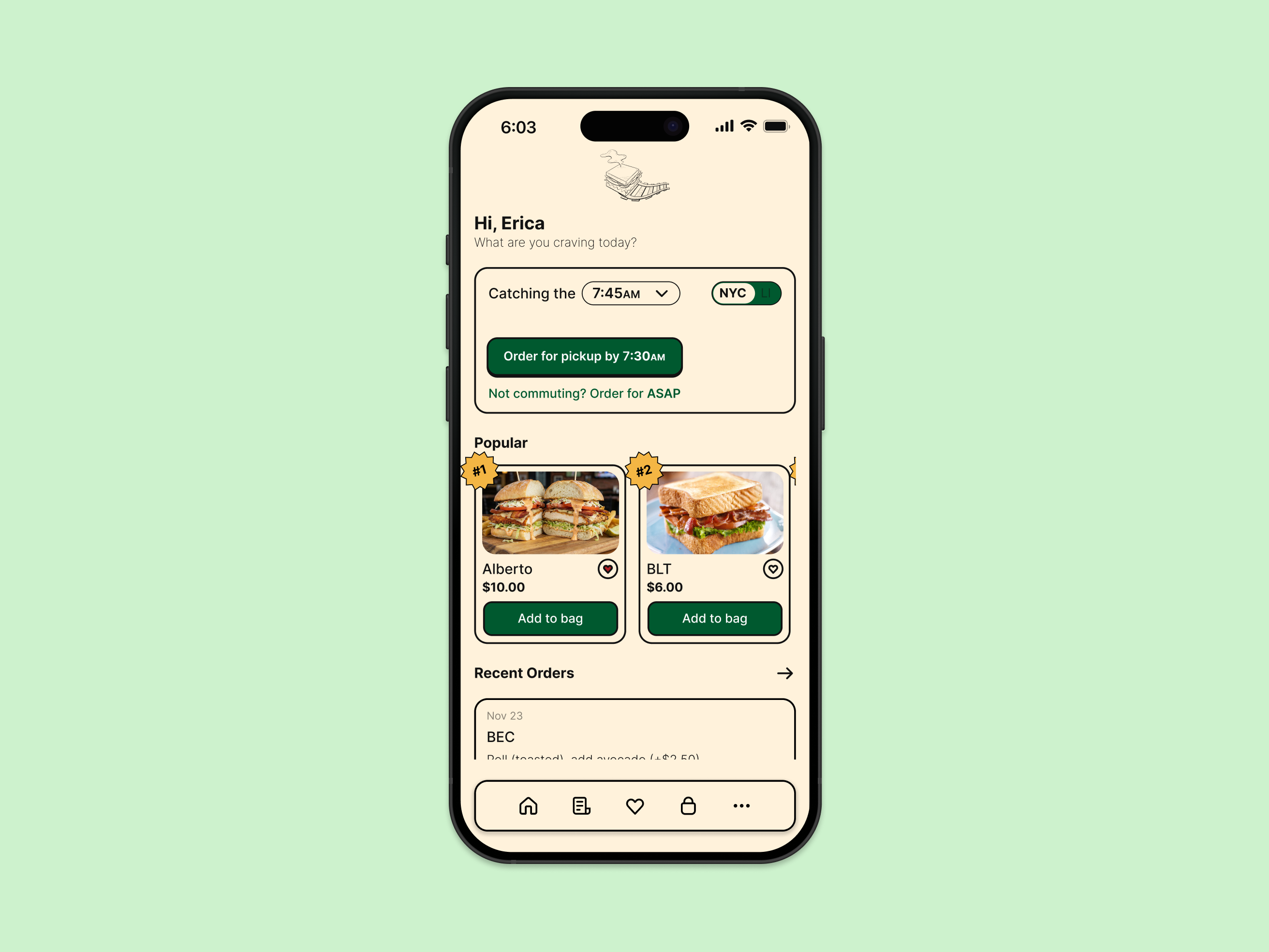
After establishing a modern brand identity through a new logo, posters, and marketing mockups, I sought to extend this transformation into the customer experience. This led to the design of a mobile pickup app, utilizing the new visual language to solve operational bottlenecks.
I presented this project at my senior capstone exhibition. In the weeks leading up to the event, I revisited the work to further refine the designs.
Commuters are forced to choose between their breakfast and their train.
Discussions with my mom highlighted a major pain point: she constantly sees customers abandon their breakfast mid-prep when they realize they are cutting it too close to the train time. This forces commuters into a high-stakes gamble, creating a stressful ultimatum between securing their meal or catching their ride.
The result is wasted food for the business and a hungry, frustrated commute for the user.
How might weredesign the morning pickup experience so commuters can grab breakfast at 192 Station Mart without ever having to gamble between their food and their train?
A first look at the solutions.
Three big ideas that replace uncertainty with transparency: an ahead-of-time pickup flow, a real-time wait visualization, and a custom sandwich builder that minimizes back-and-forth. See the full set further down in Final Designs ↓.
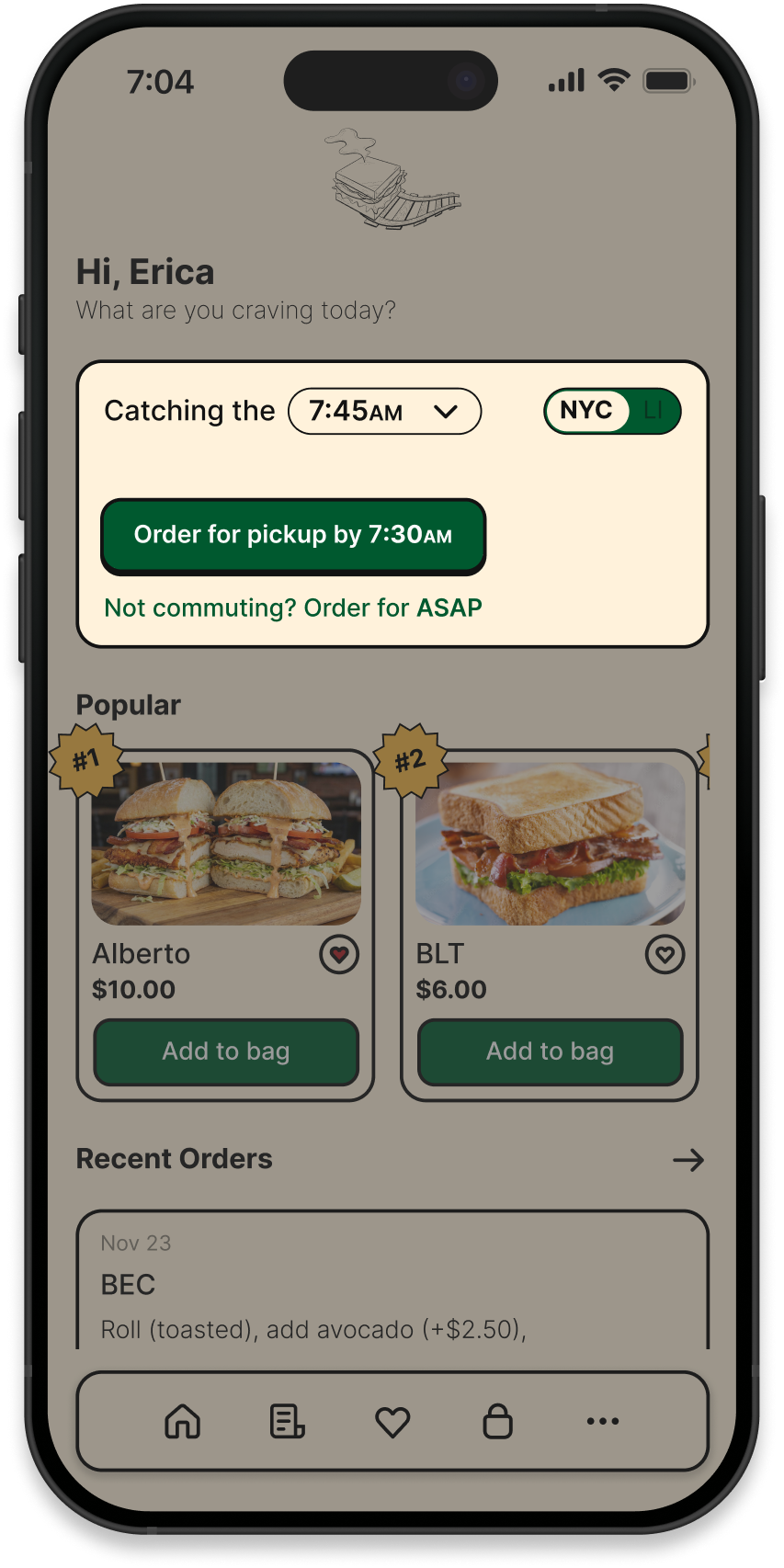
Commute Synchronization
- Integrates live LIRR data to calculate a safe pickup time.
- Accounts for walking time to prevent missed trains.
- Aligns prep time with the user's commute.
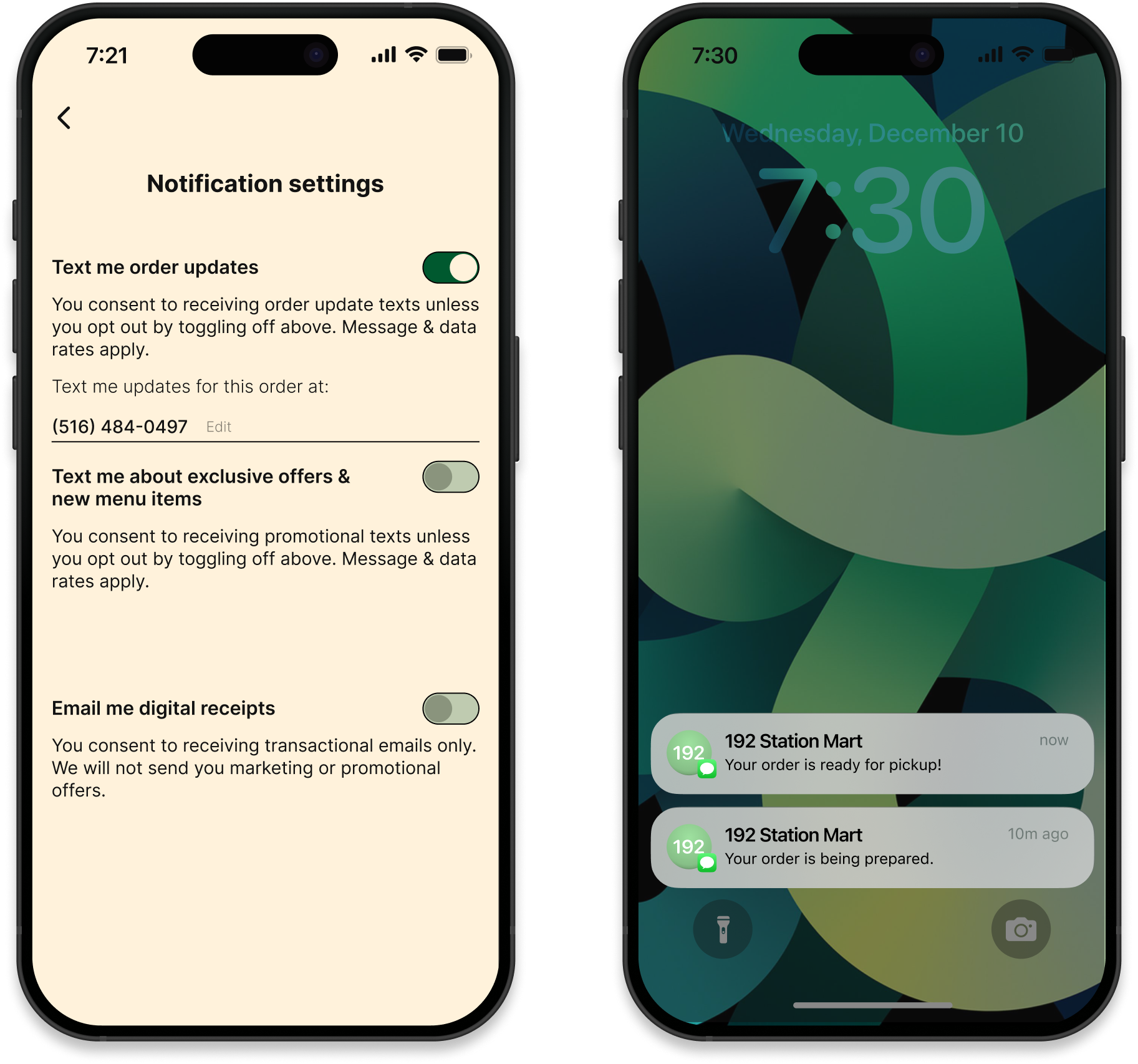
Status Transparency
- Removes the stress of the unknown.
- Mitigates wait-time anxiety by confirming exact order stages.
- Assures the food is ready before arrival.
Zero-Friction Handoff
- Bypasses the register entirely by processing payment upfront.
- Replaces waiting with instant pickup.
- Flash screen to collect without stopping.
The psychology of waiting.
I conducted research on the topics of queuing theory and consumer behavior to understand why commuters were abandoning their orders. I found that the root cause wasn't the actual wait time, but the perceived risk.
- Uncertainty magnifies time. According to David Maister's The Psychology of Waiting Lines, "anxiety makes waits seem longer," and "uncertain waits are longer than known, finite waits" (Maister, 1985).
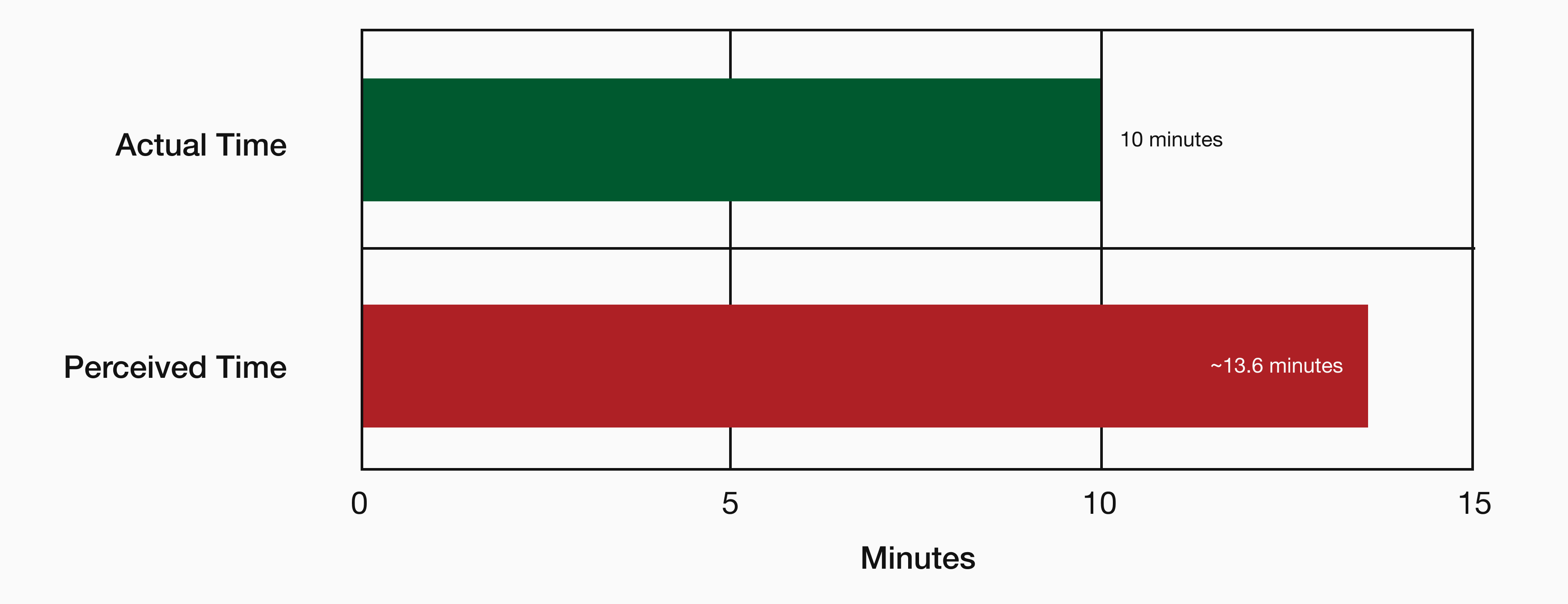
- The 36% distortion. M.I.T. operations researcher Richard Larson found that people overestimate undefined waits by approx. 36% (Stone, 2012). A standard 10-minute wait feels like 14 minutes to an anxious user. This false perception pushes them past their "breaking point," forcing them to abandon the queue.
The morning commuter.
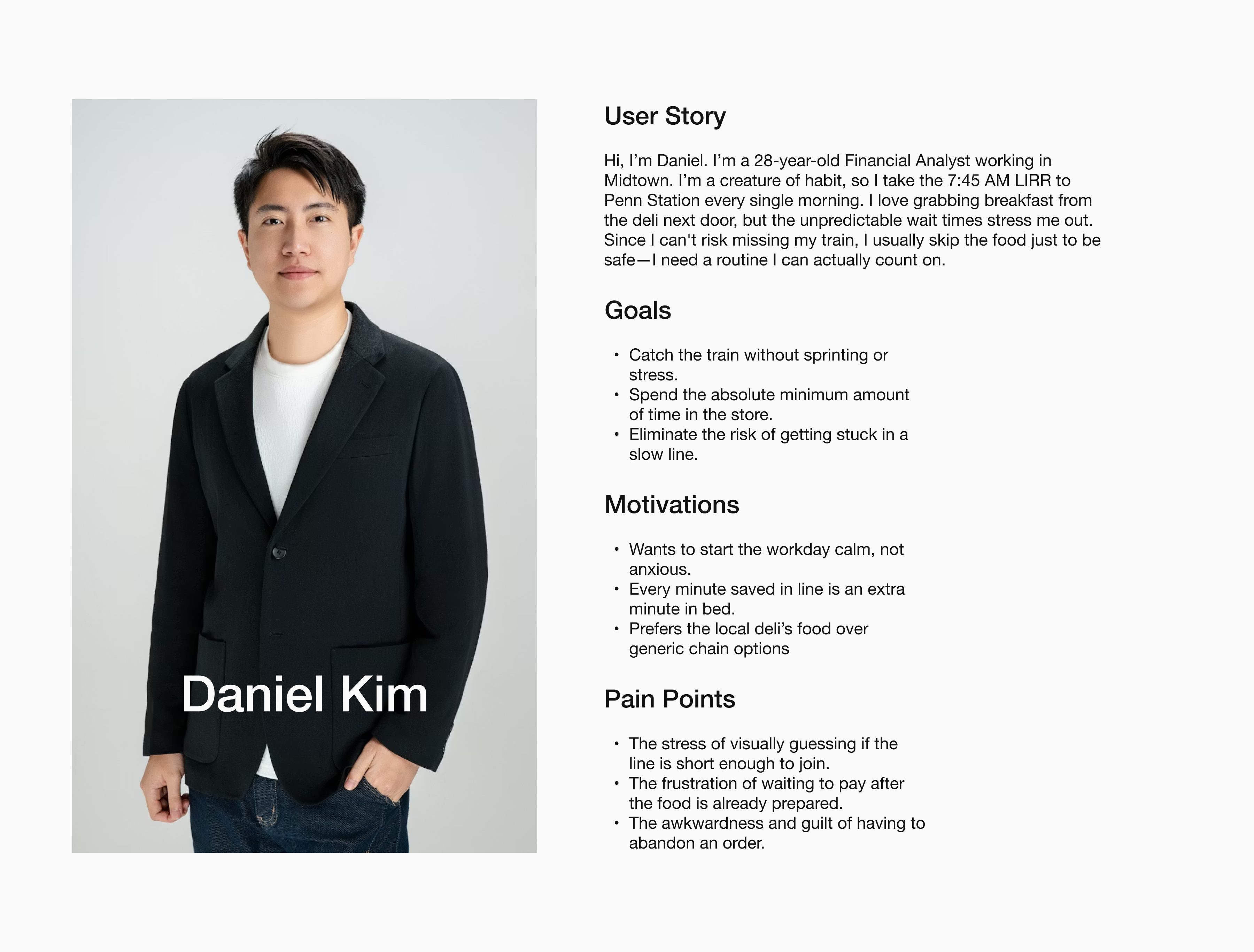
I consolidated my findings on user habits and the morning rush into a persona that embodies a regular customer at 192 Station Mart. This helped anchor my design decisions in real behaviors, specifically the tension between the desire for routine and the fear of missing the train.
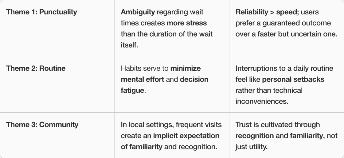
To move from empathy to strategy, I synthesized my research insights and persona behaviors into three themes that define the commuter's relationship with the store.
Sketching the flow.
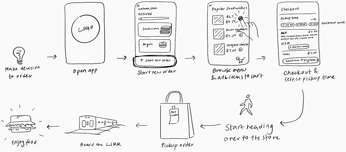
I first started off with sketching a basic user journey map displaying some of the key actions.
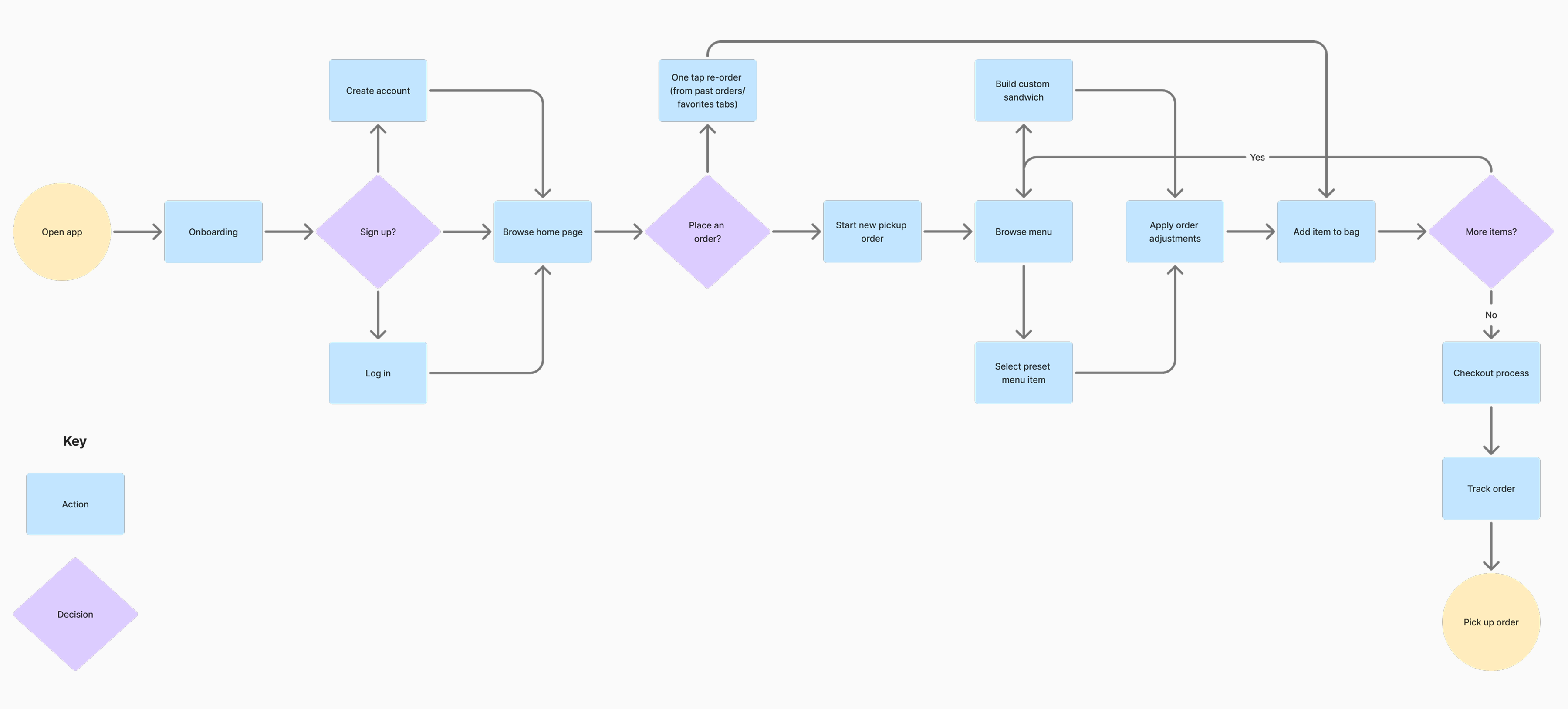
I then expanded the user flow into a more detailed diagram to better visualize the app's logic.
Putting it in front of people.
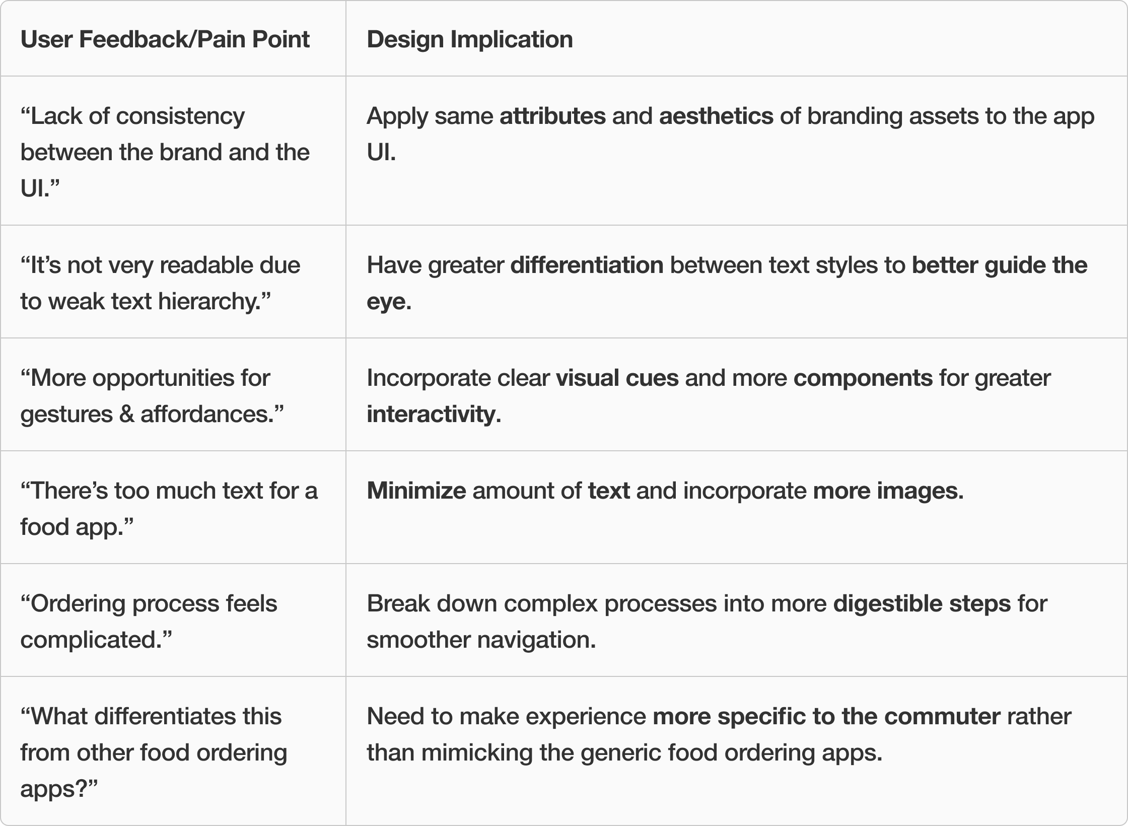
After presenting the initial prototype, I compiled the feedback from peers and professors, along with the corresponding design implications, in the table below.
What changed, and why.
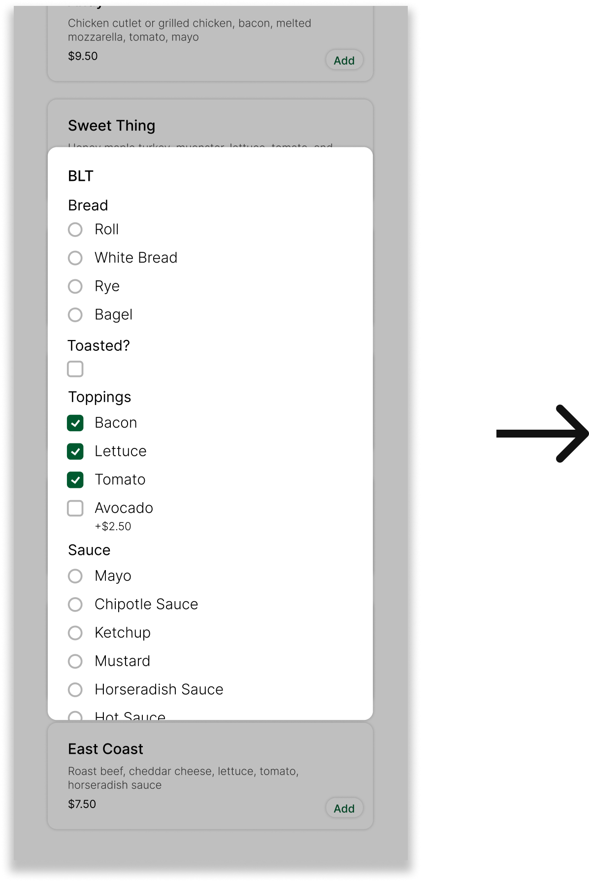
Three concrete improvements emerged from testing: clearer wait communication, a more flexible custom sandwich builder, and tighter information hierarchy on the order summary screen.
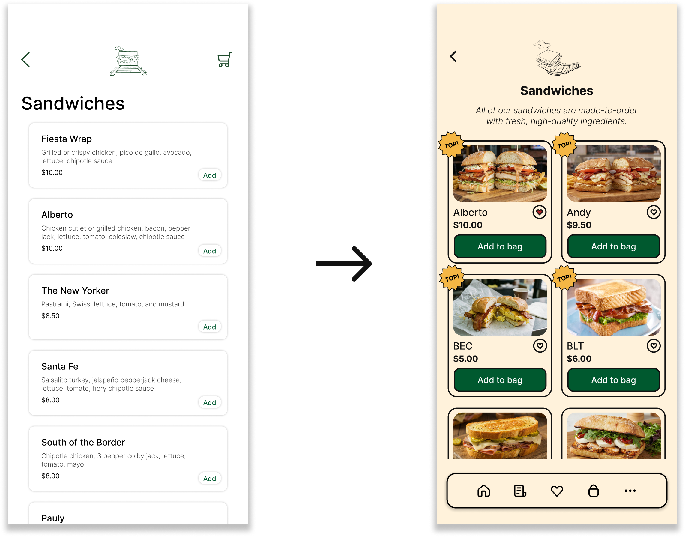
Enhanced Menu Navigation
- Prioritized product imagery over text descriptions, shifting the mental model from "reading" to "browsing."
- Implemented a bottom navigation bar to provide one-tap access to key sections at all times.
Optimized Workflow
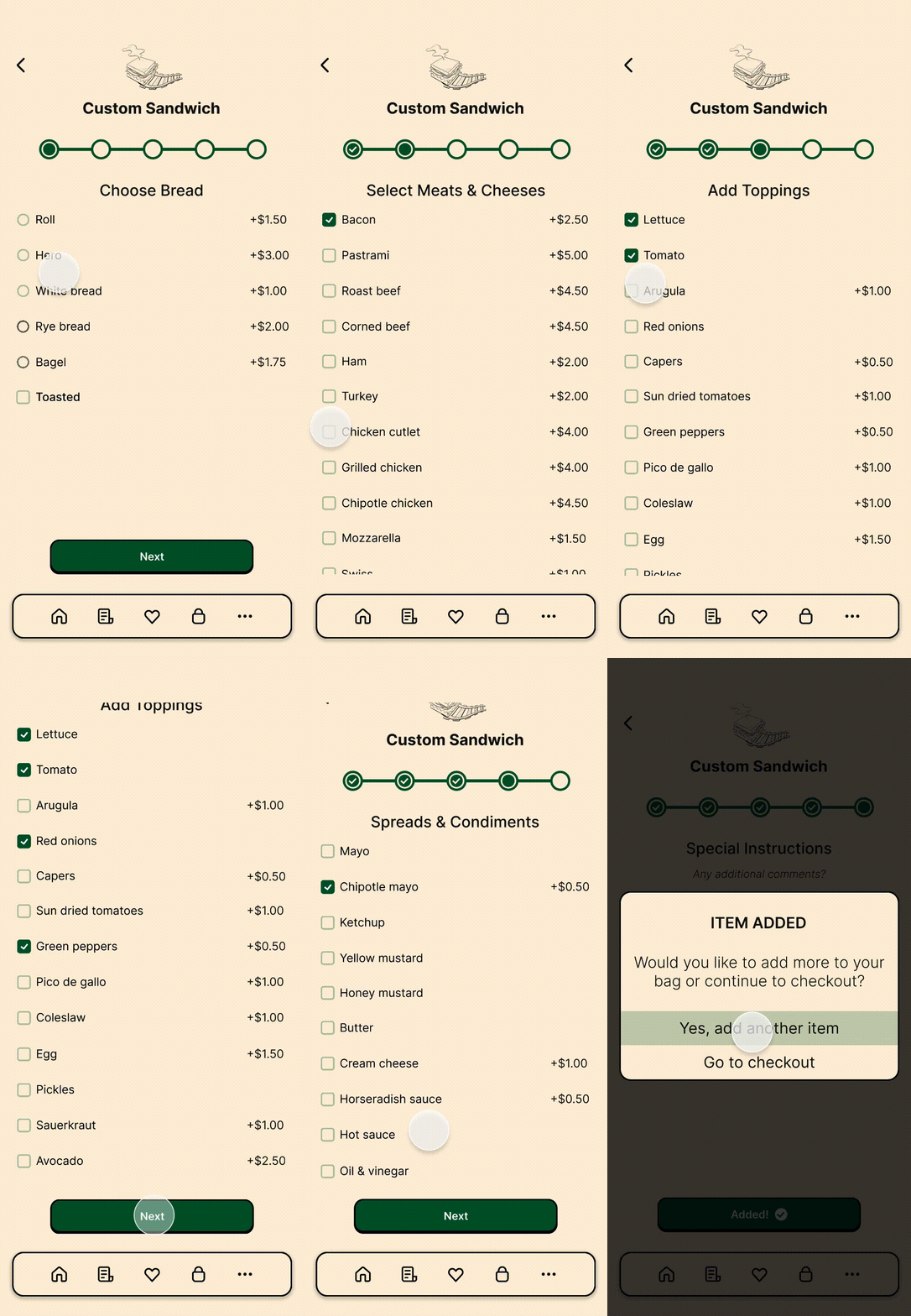
- Replaced the long scrolling form with a paged layout, letting users focus on just one decision at a time.
- Implemented a progress bar to orient users, replacing vague scrolling with a defined finish line.
Proactive Scheduling
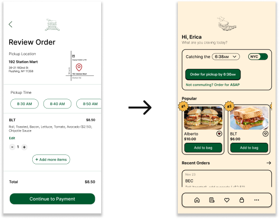
- Shifted the primary timing decision upstream to avoid last-minute calculations at checkout.
- Contextualized the flow to prioritize external constraints (the train) over standard ordering patterns.
The final designs.
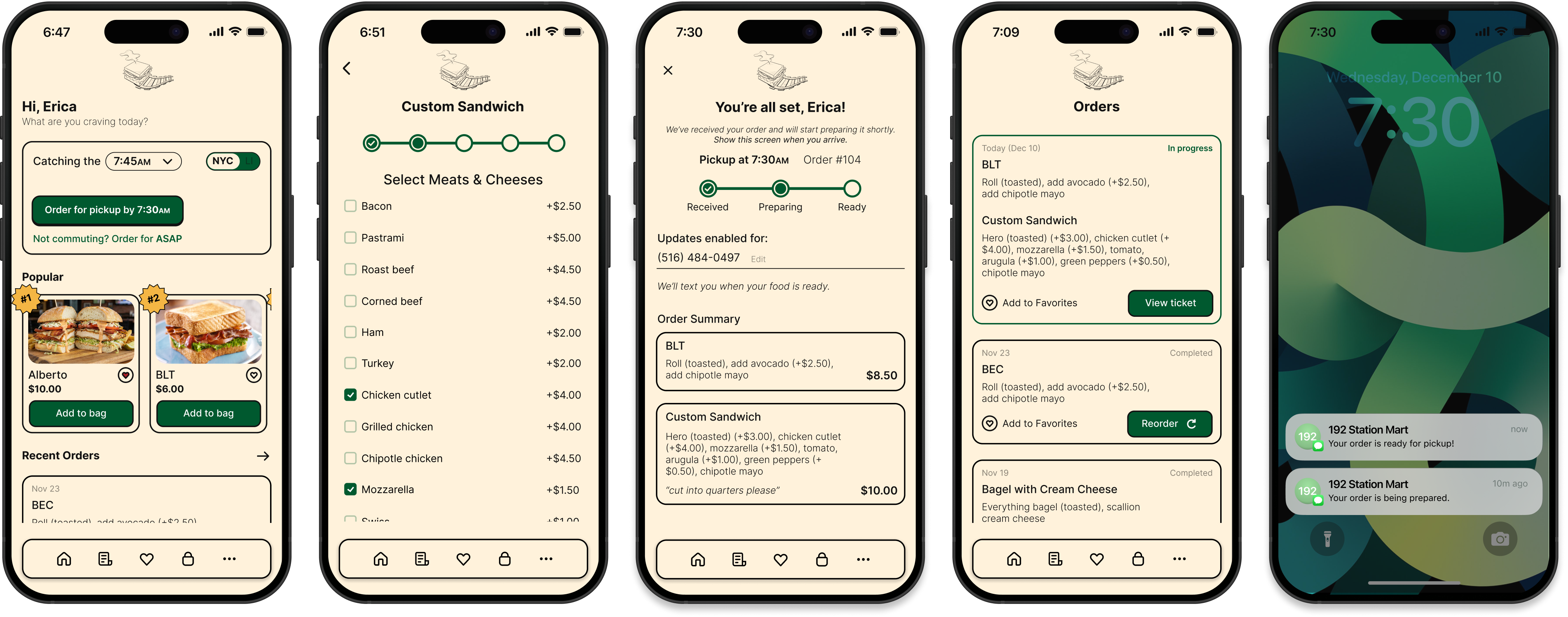
Main flow
Onboarding
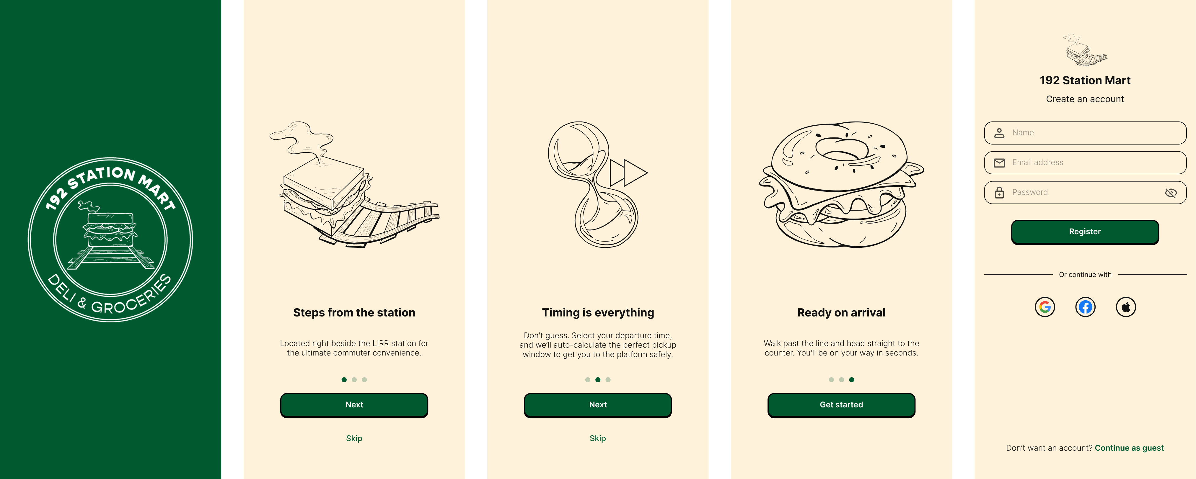
Menus
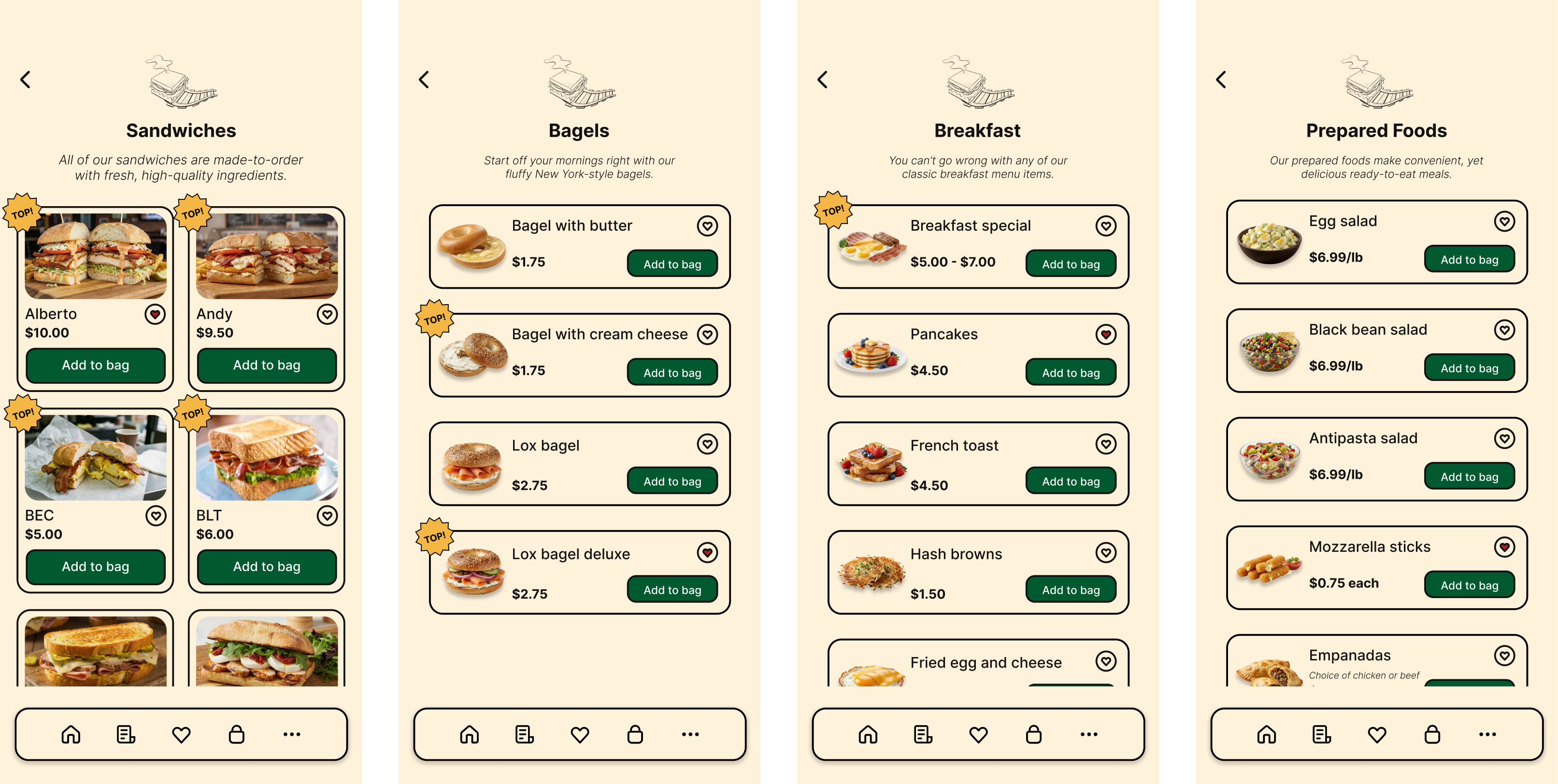
Additional pages
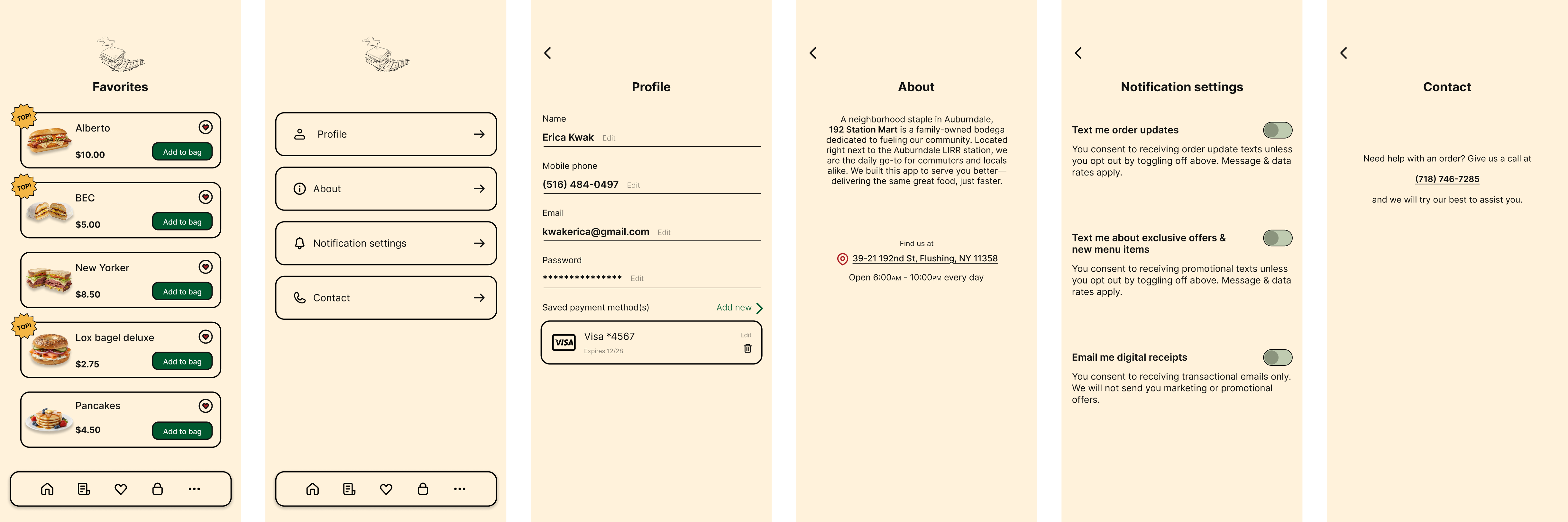
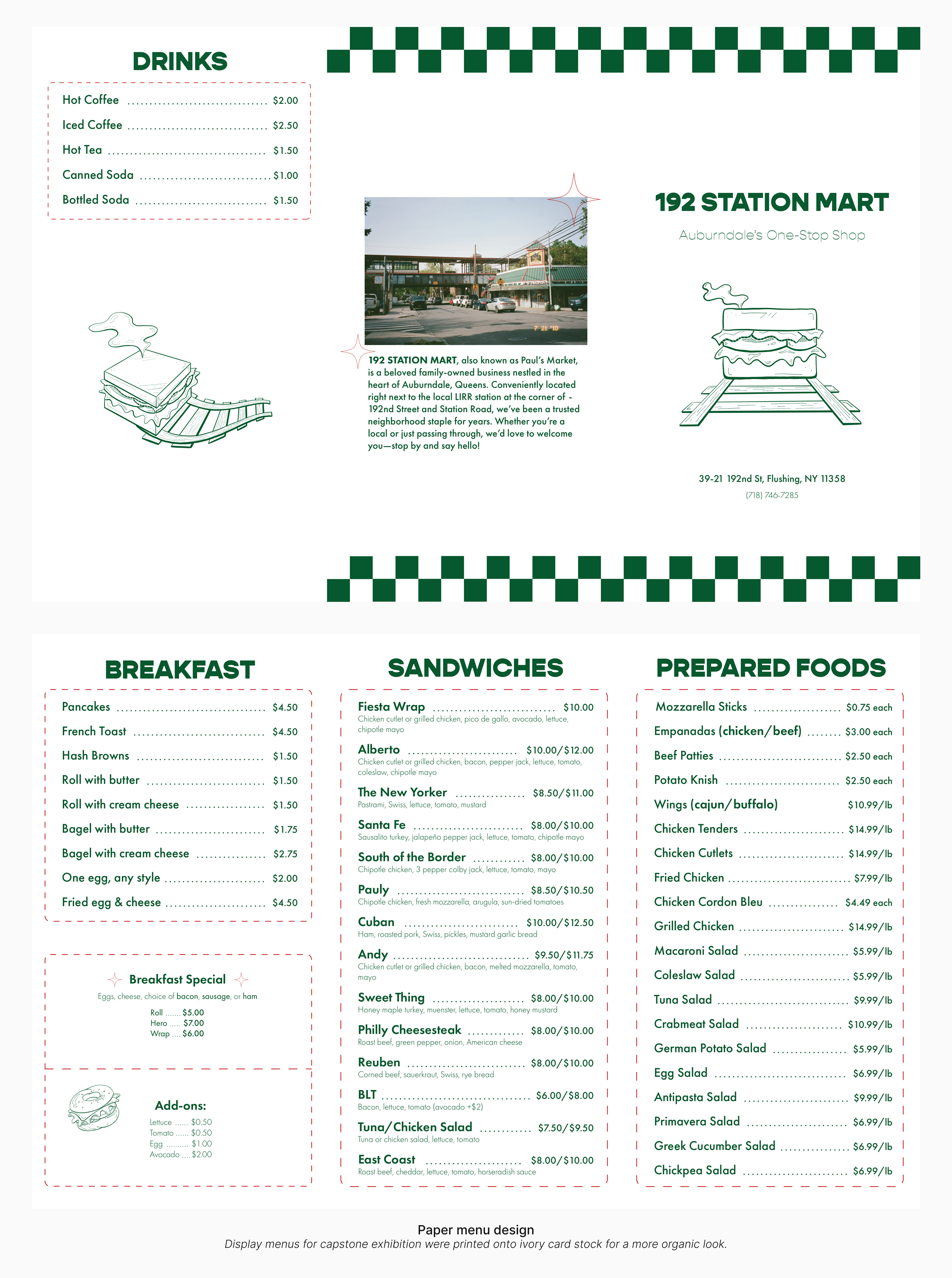
And if you're curious…
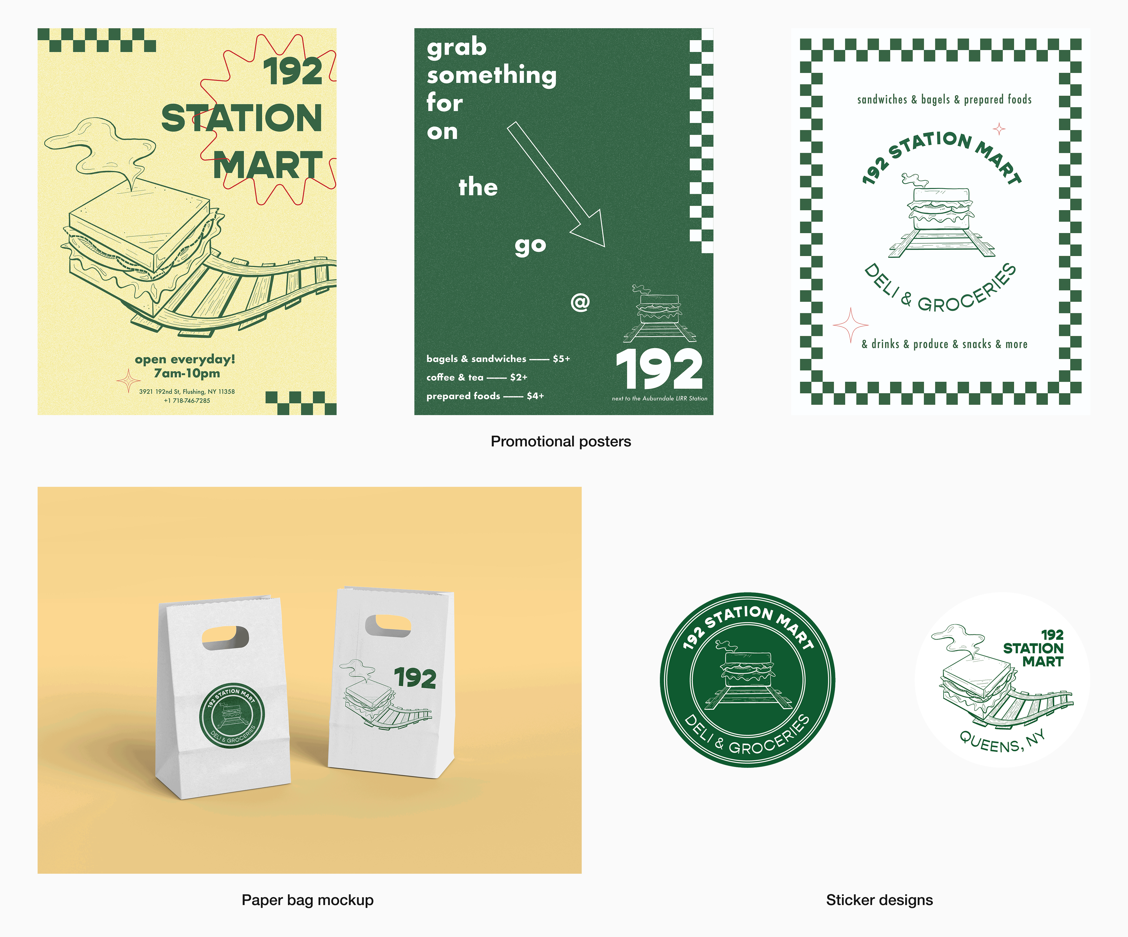
Looking back & ahead.
- Include an additional tab on the bottom nav bar that displays the entire menu. The only way to view all the menu items is after pressing the "Order for pickup" button.
- Add coffee and other beverages. The self-serve coffees are a hot commodity in the mornings, but I forgot to include this in the menu.
- Format the "Bagels," "Breakfast," and "Prepared Foods" sections like the "Sandwiches" one—grid-like and with more emphasis on the images. I decided against this initially because I wanted to highlight the sandwiches (since they are the most popular), but now I'm frustrated by the inconsistency.