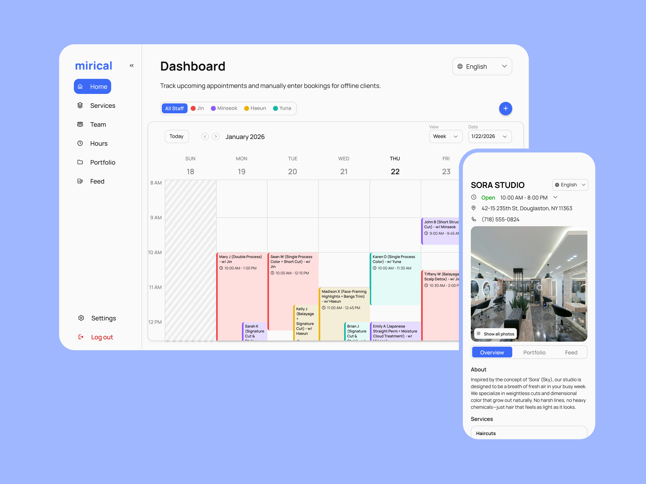
Bridging a generational gap in service businesses.
Mirical is a live scheduling platform born from a personal frustration: the anxiety of navigating appointment bookings at Korean salons with our broken Korean.
We realized that this friction wasn't just awkward for us, it represented a massive, untapped market of traditional businesses disconnected from modern consumers.
Developed in a close-knit partnership—myself as Lead Designer and my brother as Lead Engineer—we set out to bridge this gap. My role focused on architecting the core user experience and designing a clean, modular interface system. By prioritizing simplicity and standardizing UI components, I created a flexible framework that allowed us to scale the platform from a niche solution into a multi-language tool for service business owners.
Language barriers and analog methods render capable businesses invisible to digital consumers.
In-depth research with a traditional salon owner revealed a critical growth ceiling: while she could manage existing regulars via phone, she had no way to capture new customers who search for services online. Her fear of complex software setup didn't just cause administrative stress, it effectively hid her business from the digital marketplace.
This "digital invisibility" means that every time she avoids technology, she leaves potential revenue on the table for competitors who are easier to discover.
How might webuild a streamlined management tool that empowers traditional service business owners to overcome digital and language barriers, enabling them to reach modern consumers and grow their customer base?
A first look at the solutions.
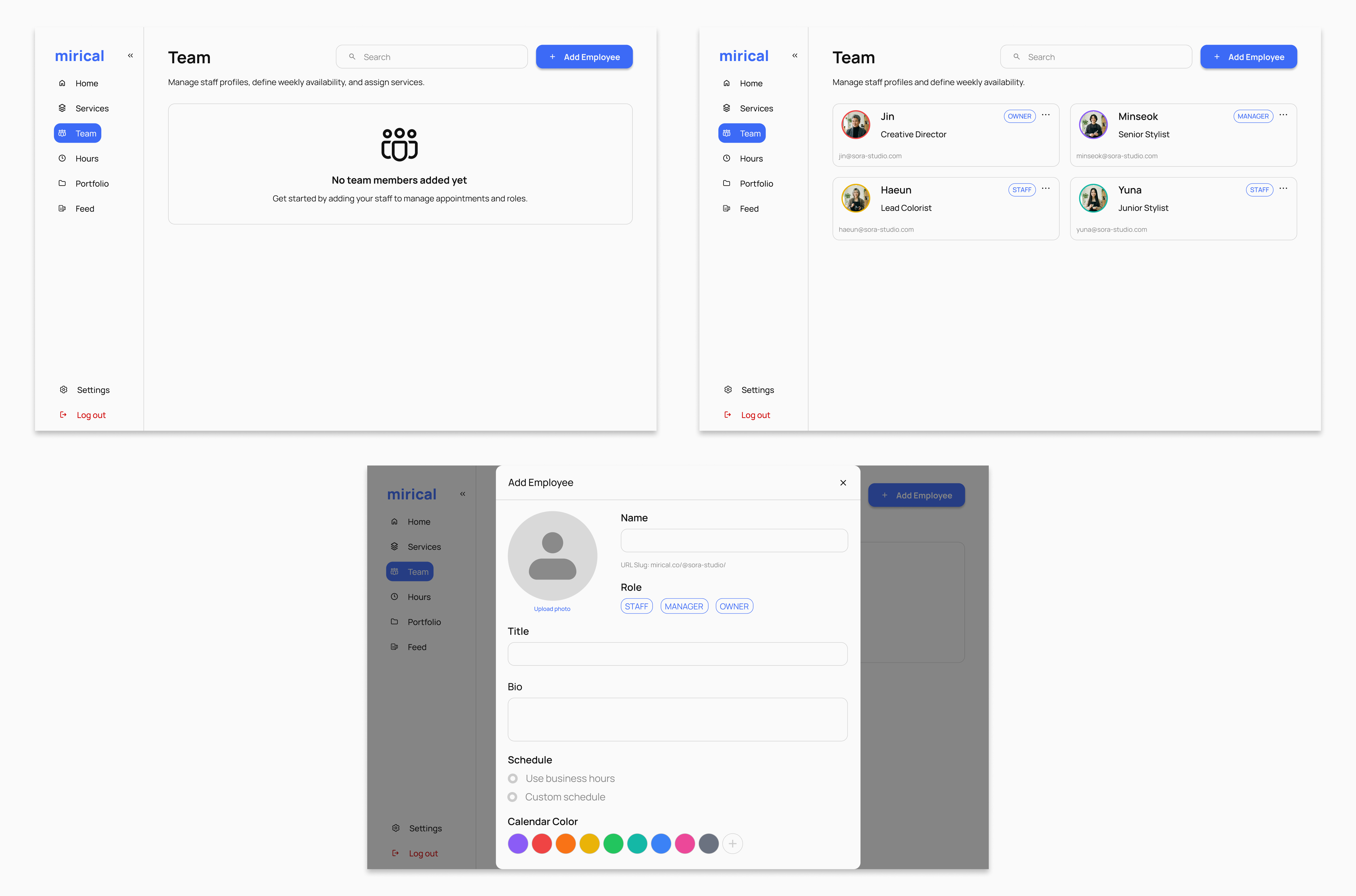
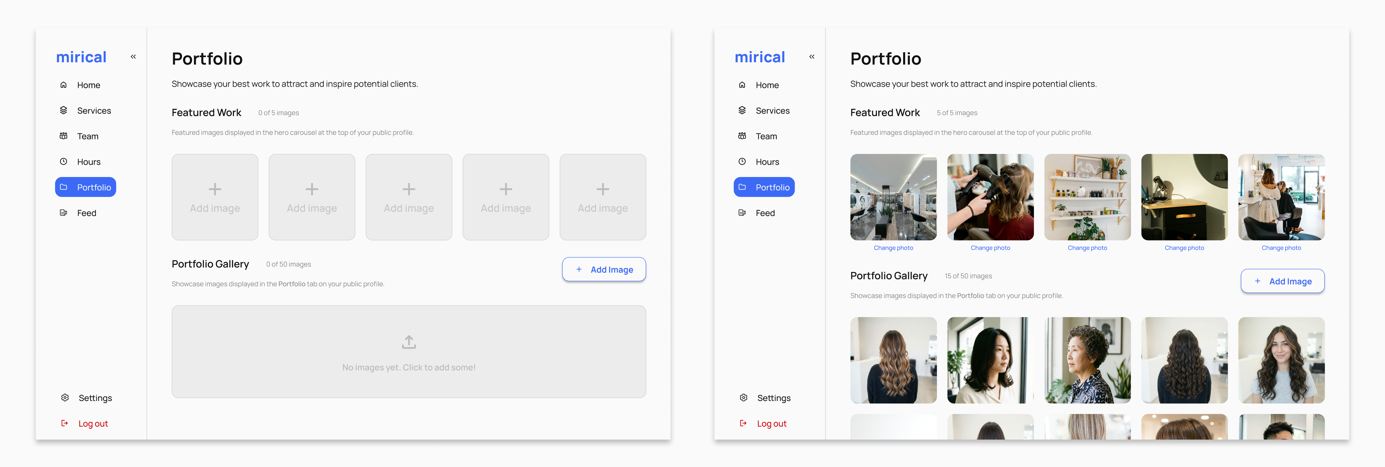
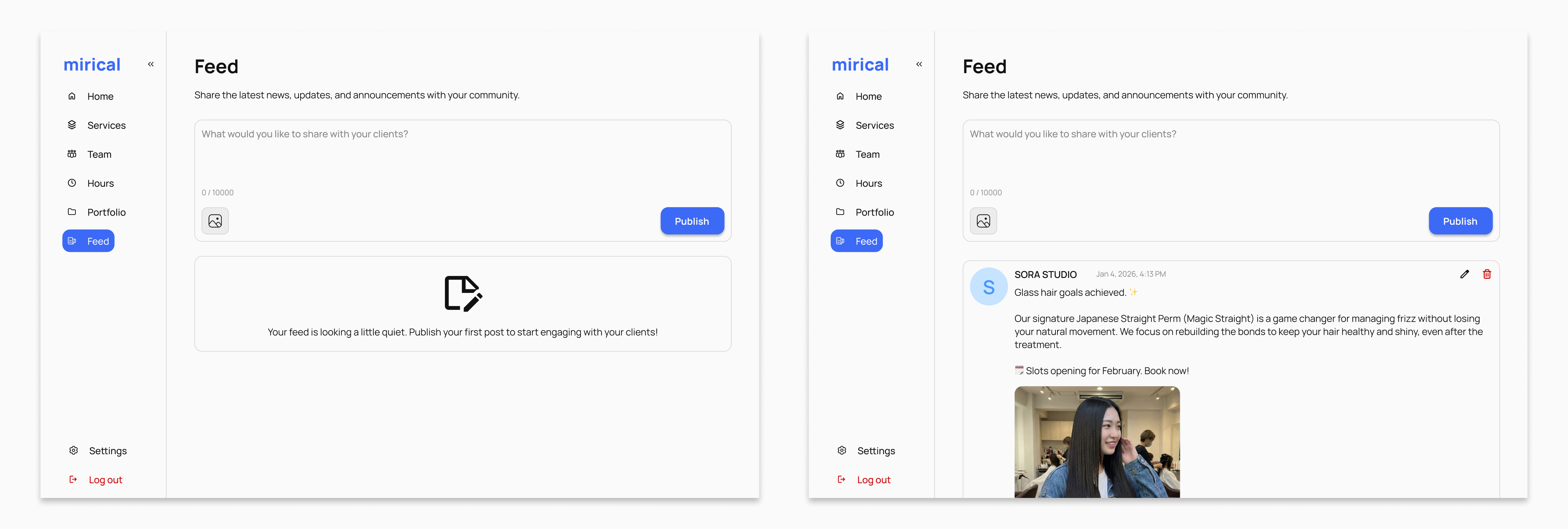
Three pillars guided the platform design: a frictionless onboarding flow, a visual-first dashboard, and a modular system that scaled across business types and languages. See the full set further down in Final Designs ↓.
Frictionless Activation
- Lowers the barrier to entry by asking for only core essentials.
- Prevents drop-off by clearly outlining the next required setup steps.
- Prioritizes immediate account creation to keep user momentum high right out of the gate.
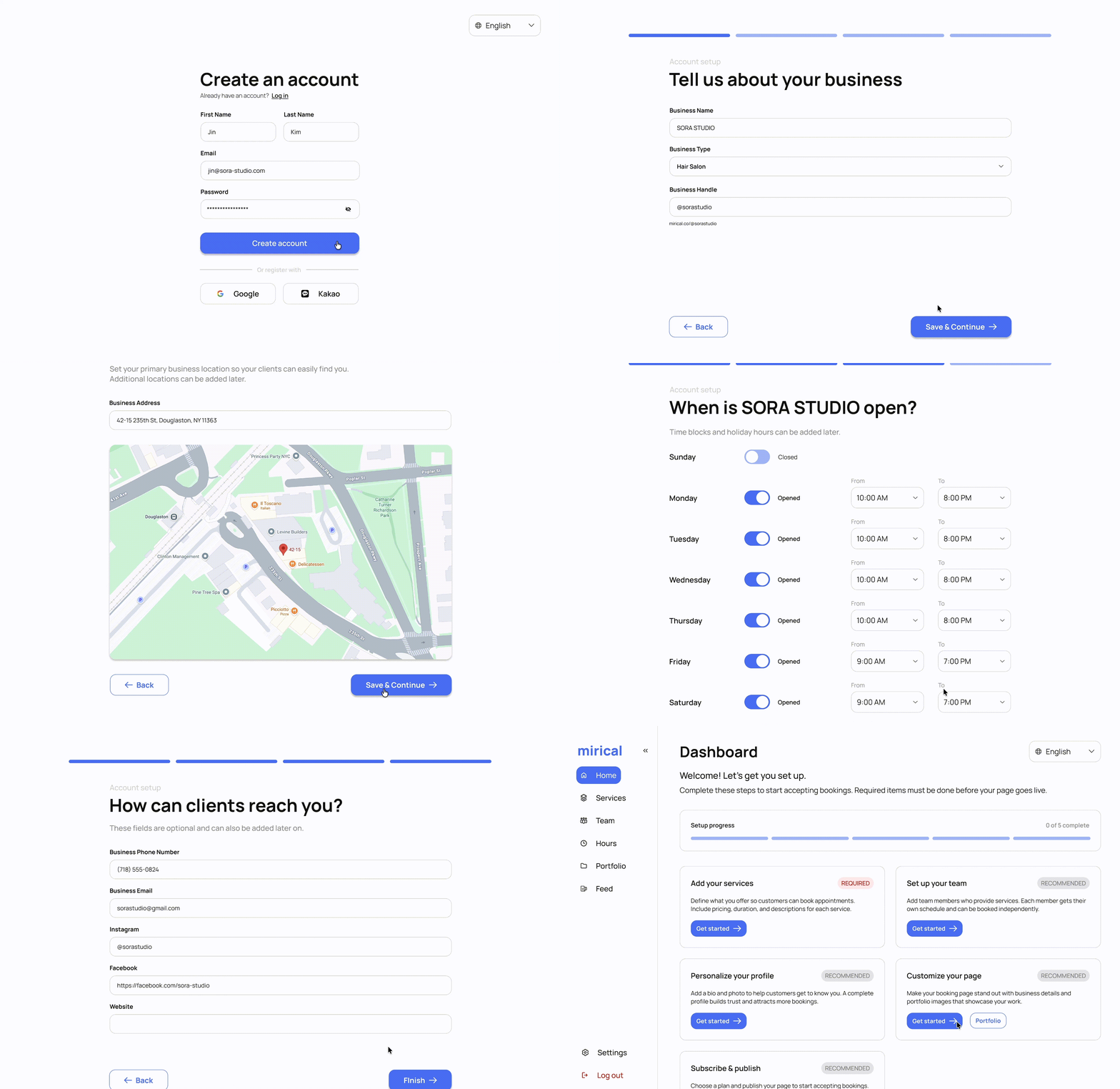
Instant Storefront
- Assembles a complete, bookable landing page using all provided setup details.
- Eliminates the burden of ongoing website management or formatting.
- Unlocks immediate online visibility to drive bookings.
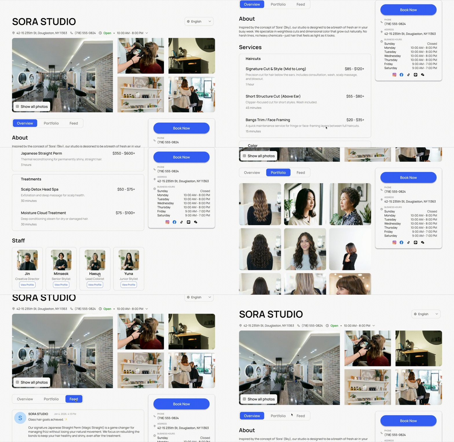
Non-Verbal Consultation
- Bridges language gaps via reference photo uploads.
- Removes bill anxiety with upfront pricing and timing.
- Facilitates informed choices via visual stylist profiles.
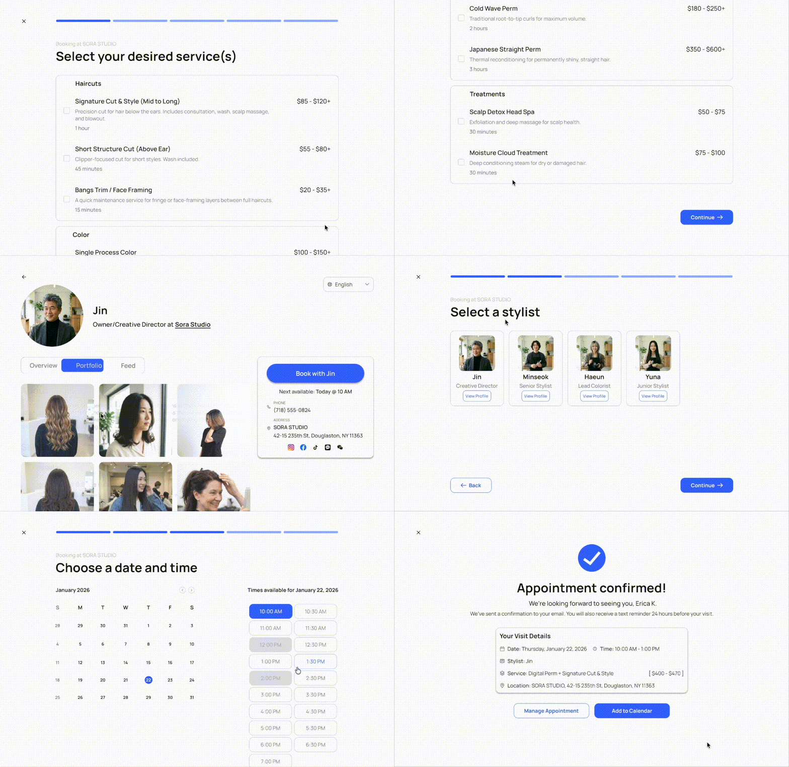
Listening before designing.
White paper research
I analyzed industry data to understand exactly why traditional businesses struggle in a digital world. The numbers highlighted three major obstacles: complicated setup tools, a lack of online visibility, and customer anxiety around phone calls.
- 72% of users will abandon an app setup entirely if the process feels too complex or non-linear.
- 81% of consumers perform online research before they are willing to book a new service.
- 75% of Gen Z respondents report avoidance and anxiety when required to make phone calls.
Competitive analysis
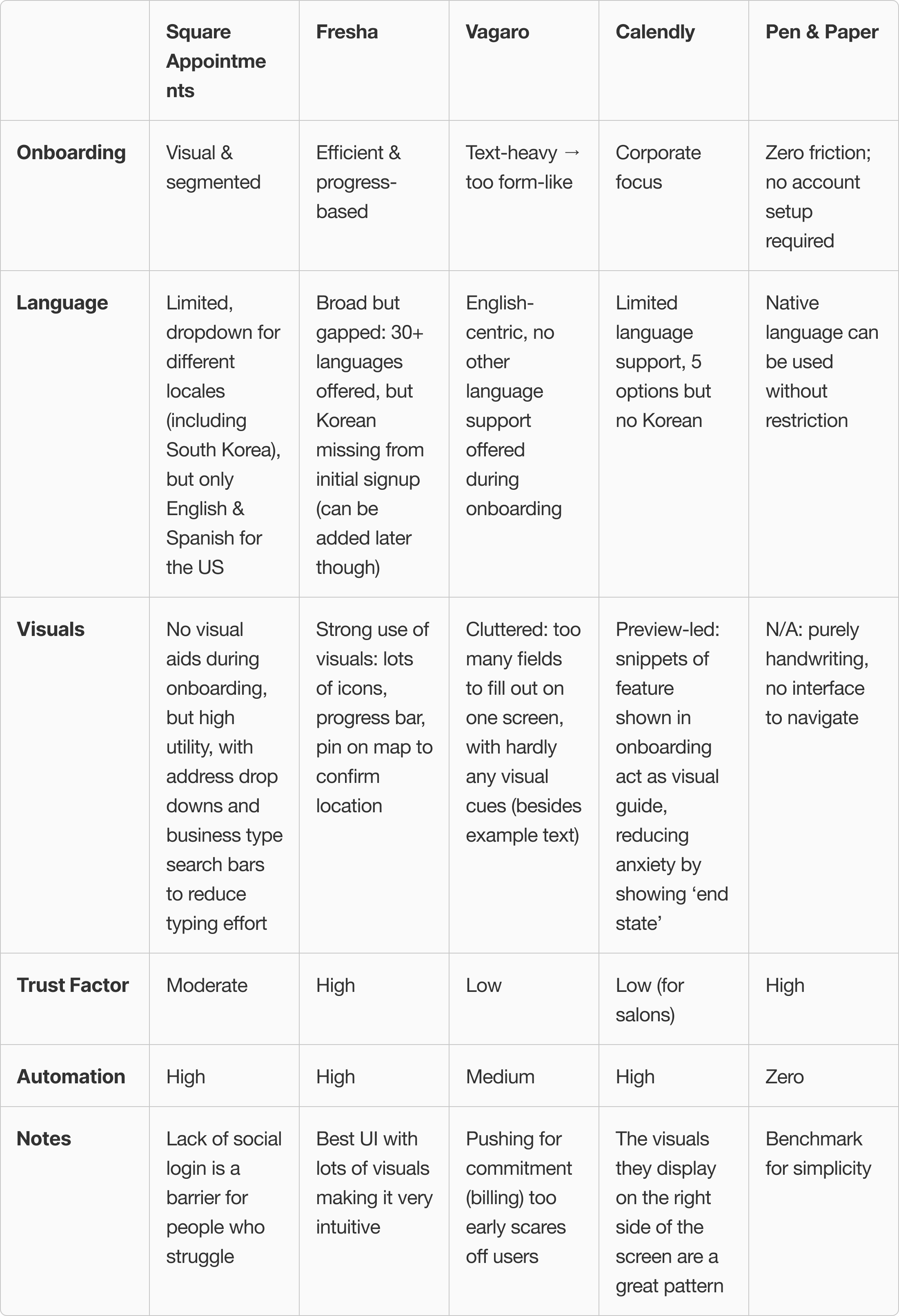
An audit of five major platforms revealed a critical gap: competitors prioritize dense, text-heavy dashboards over visual cues. These high-friction interfaces overwhelm non-native speakers, failing to rival the intuitive simplicity of pen and paper.
User interview
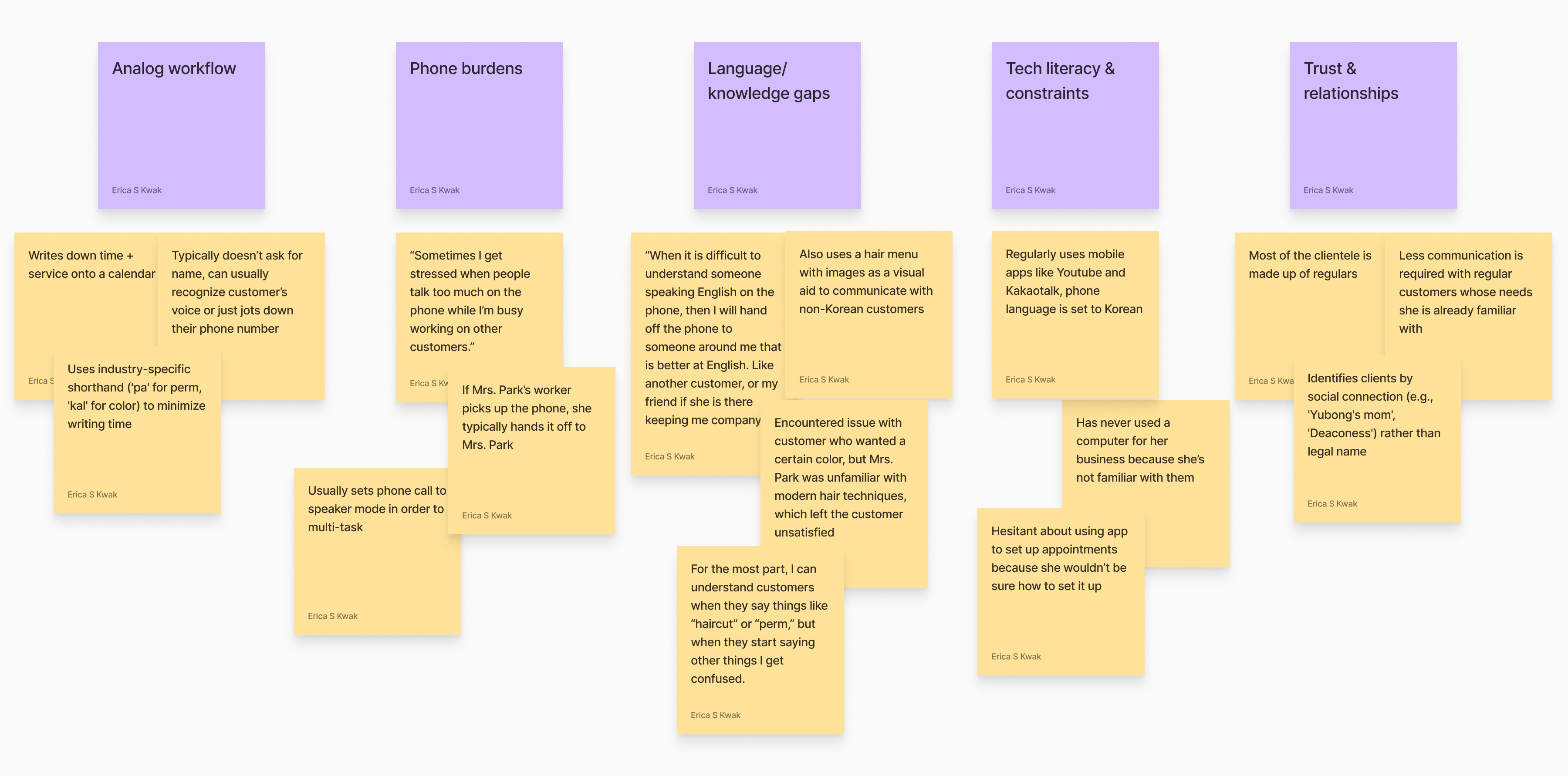
To ground the project in reality, I observed Mrs. Park at Cherry Hair Salon to deconstruct her existing pen-and-paper workflow. My goal was to identify the friction points in her current system and uncover the underlying reasons why she remains hesitant to adopt digital solutions.
From empathy to strategy.
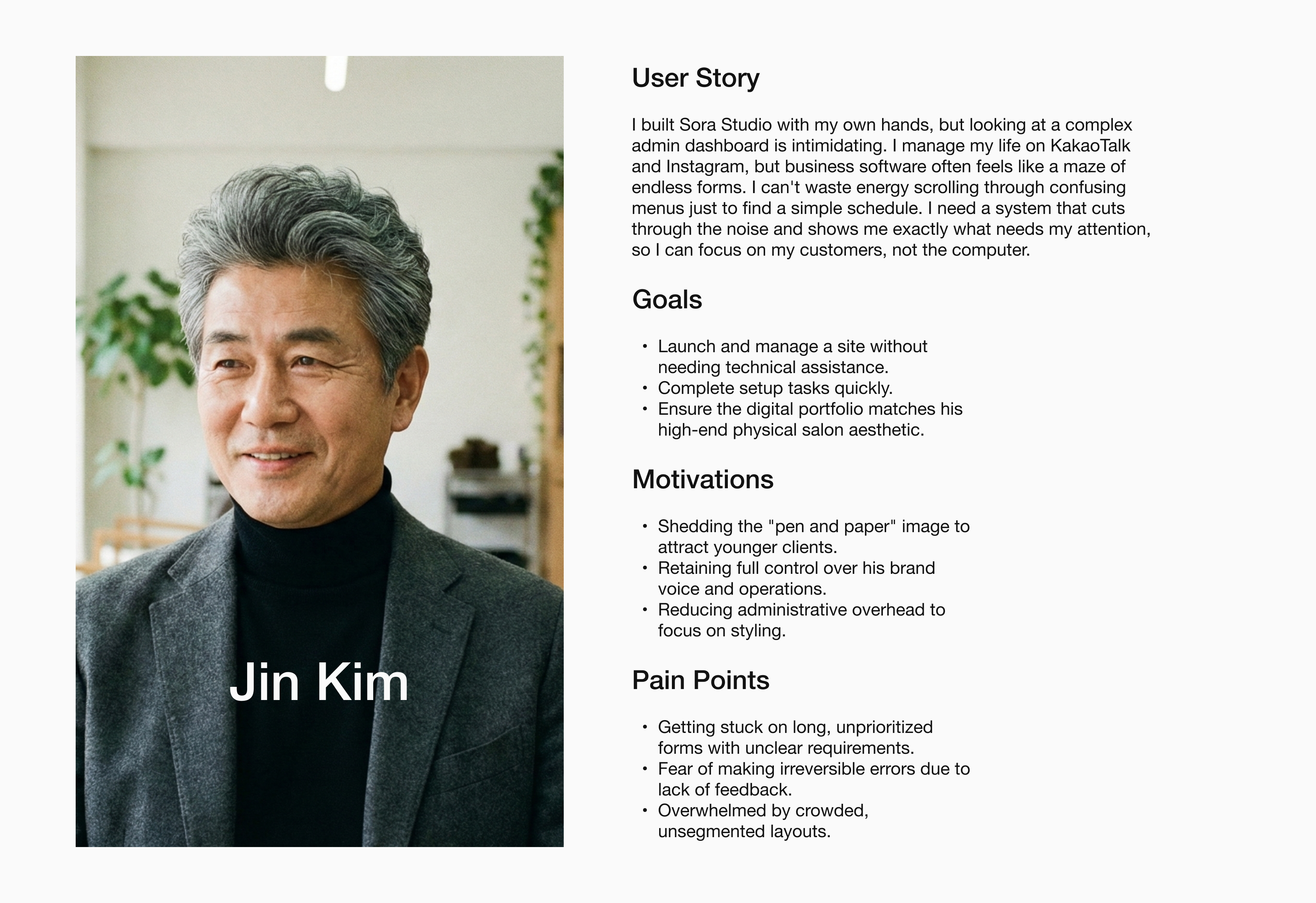
I consolidated this research into a primary persona to represent the target user. Jin Kim acted as a critical reference point throughout the project, allowing me to validate that my design decisions were solving for specific user constraints rather than assumptions.
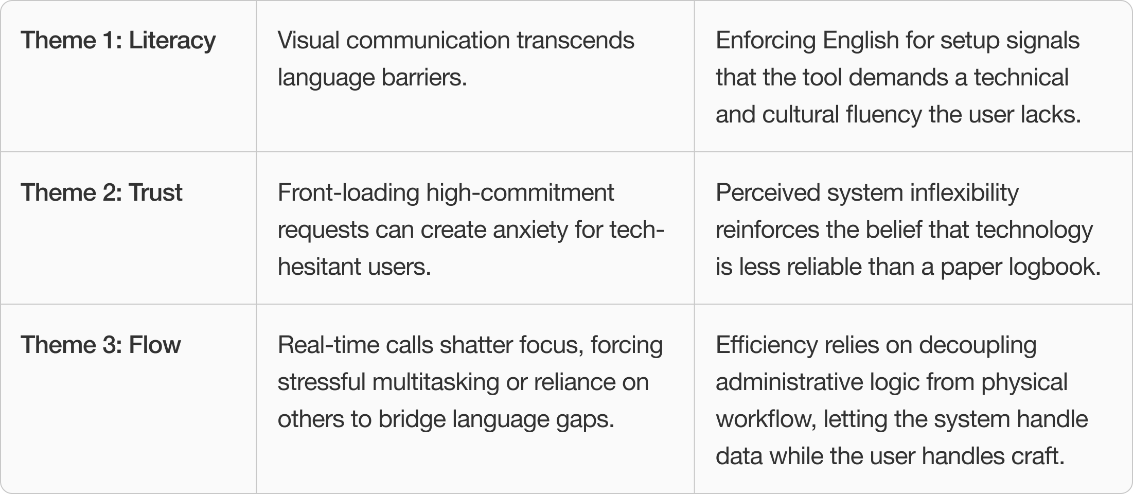
To move from empathy to strategy, I synthesized my research insights and persona behaviors into three themes that defined the design direction.
Sketching the flow.
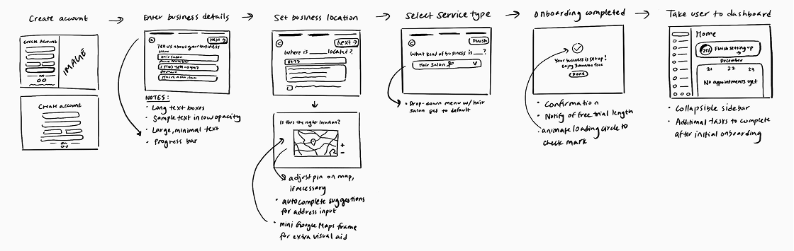
I first started off with sketching a basic user journey map displaying some of the key actions needed for onboarding.
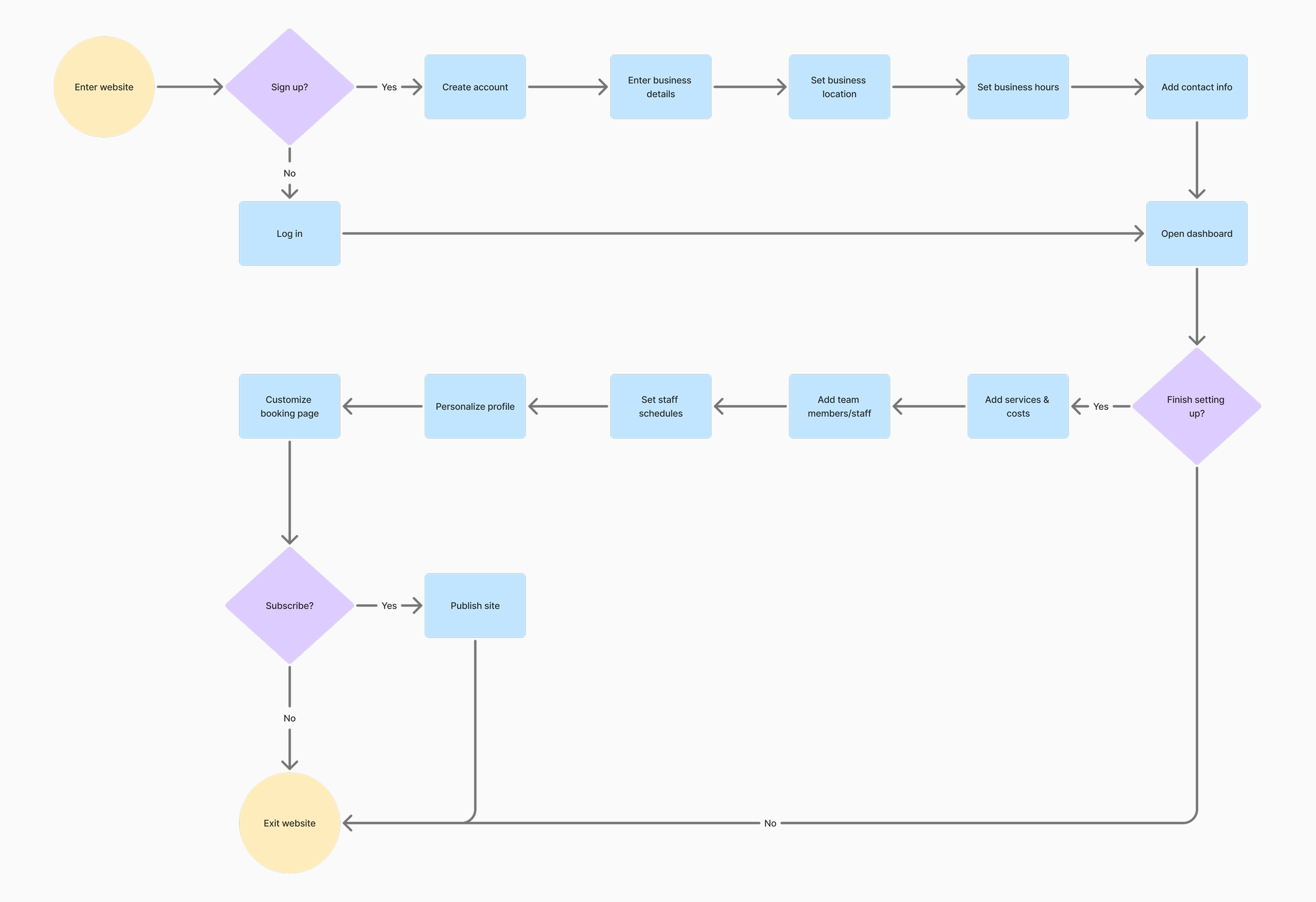
I then expanded the user flow into a more detailed diagram to better visualize the app's logic.
A continuous feedback loop.
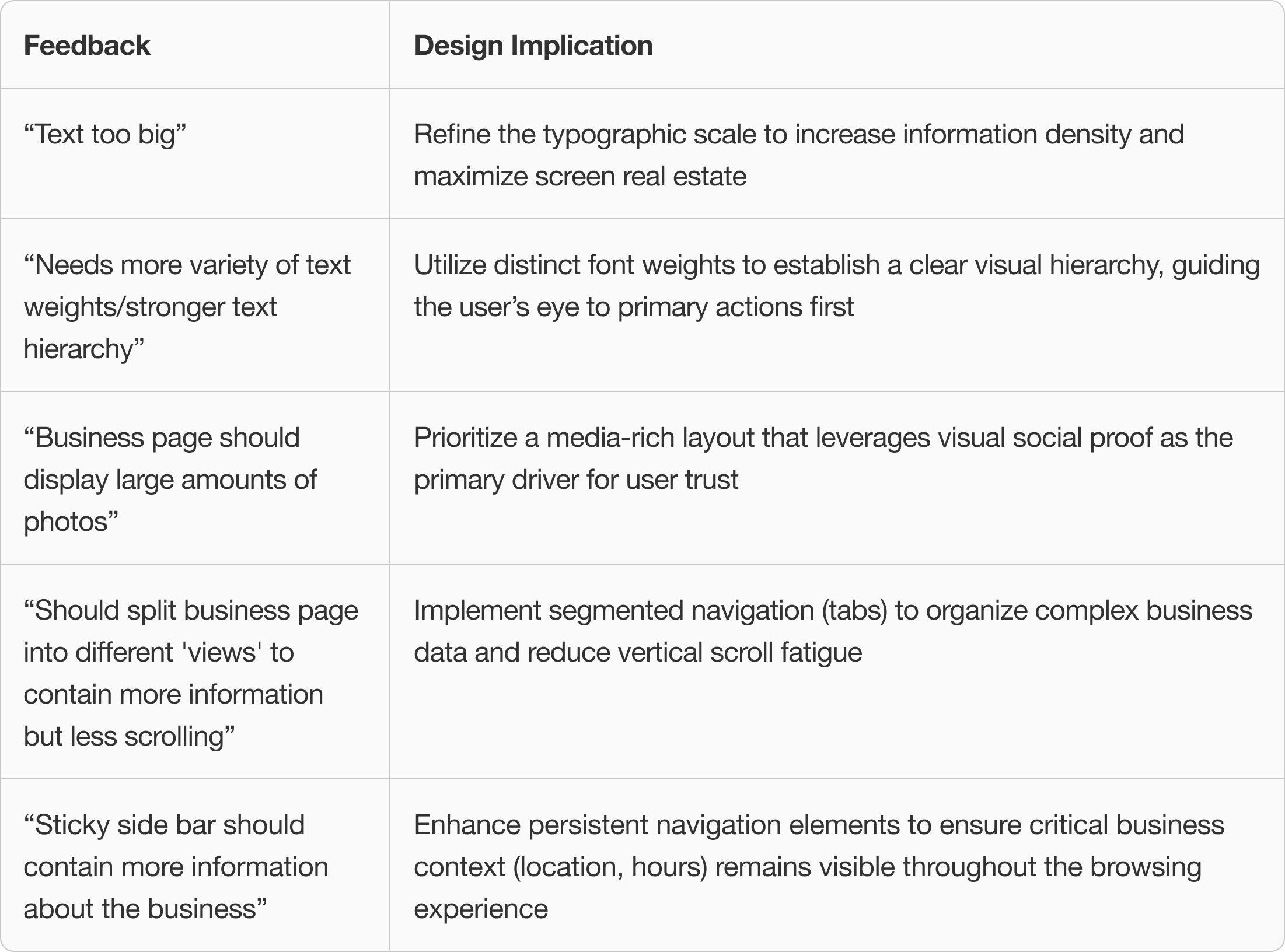
To maintain MVP velocity, I established a continuous feedback loop with my brother. These consistent design critiques provided a fresh perspective, allowing me to identify visual gaps and refine the aesthetic polish in real-time without slowing down development.
What changed, and why.
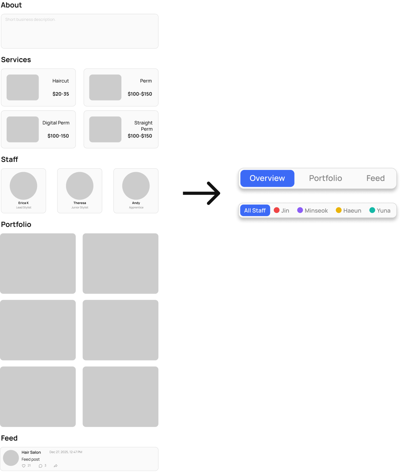
Critiques surfaced three concrete improvements that sharpened the visual hierarchy, tightened the onboarding flow, and made the dashboard more scannable at a glance.
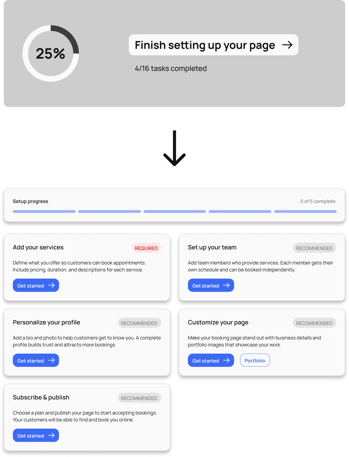
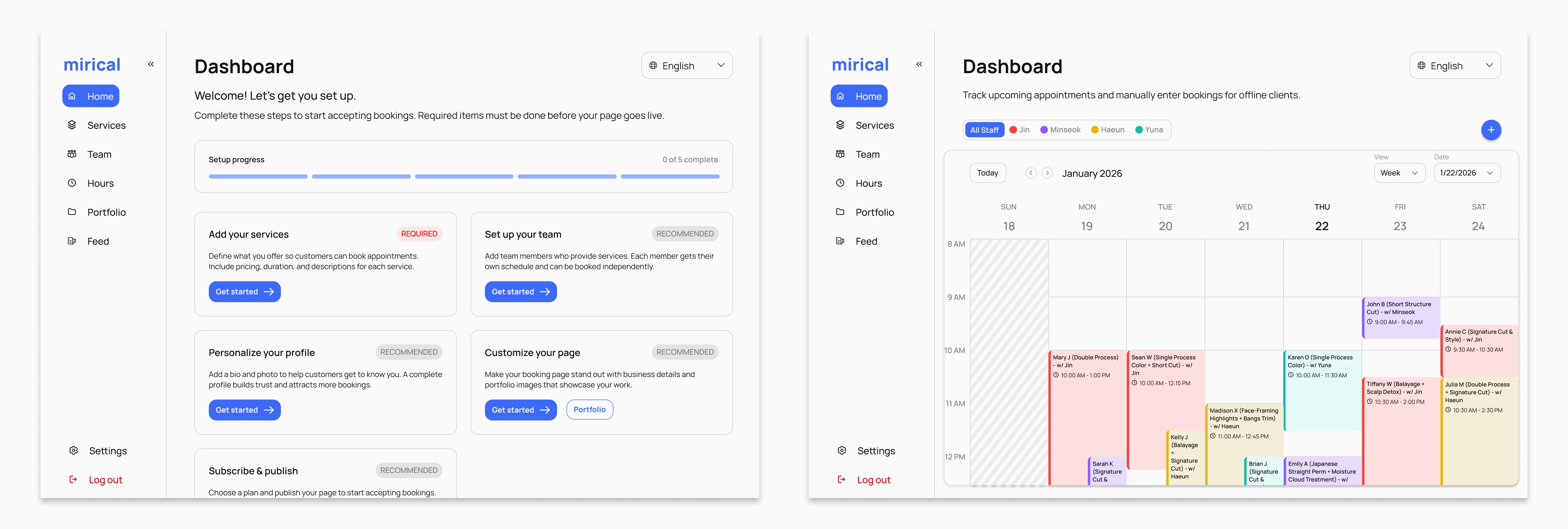
Prioritized Action Flow
- Redesigned the dashboard as a centralized setup hub, isolating only the steps required to go live.
- Applied visual priority labels ("Required" vs. "Recommended") to focus user effort on critical blockers first.
Streamlined Content Organization
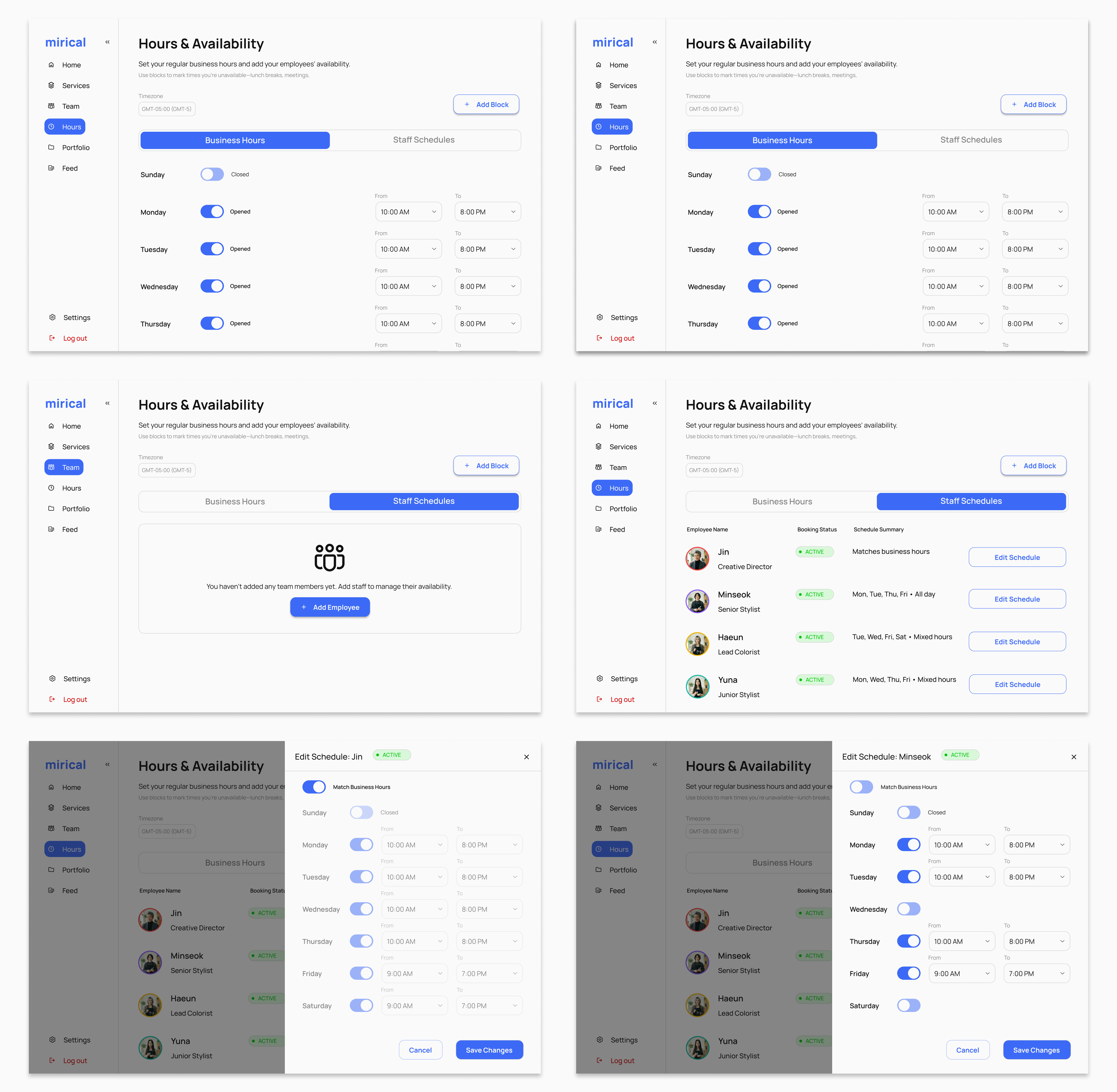
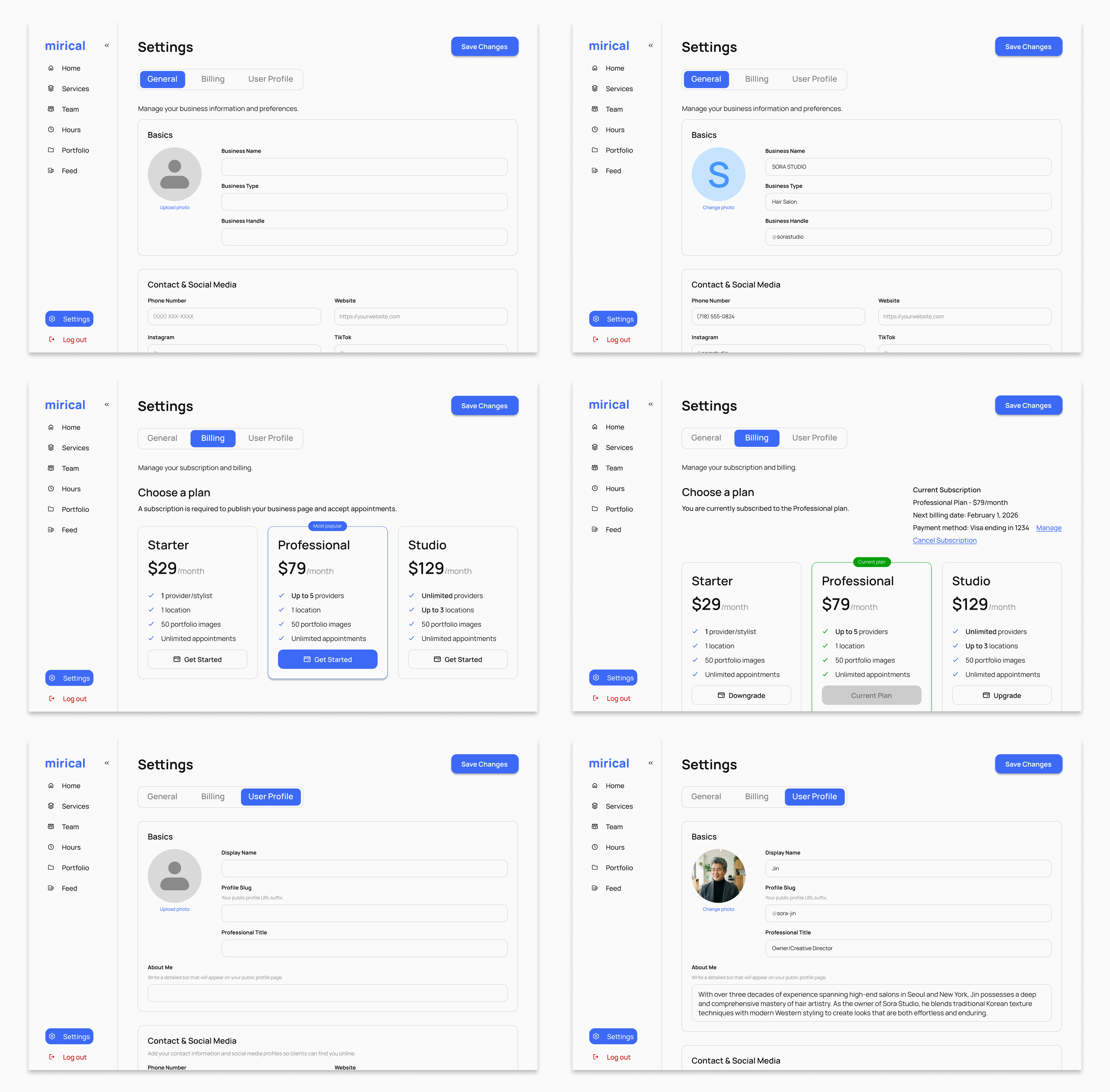
- Implemented tabbed navigation to segment complex pages into digestible, focused views.
- Added dynamic calendar filtering to isolate specific staff schedules and reduce visual noise.
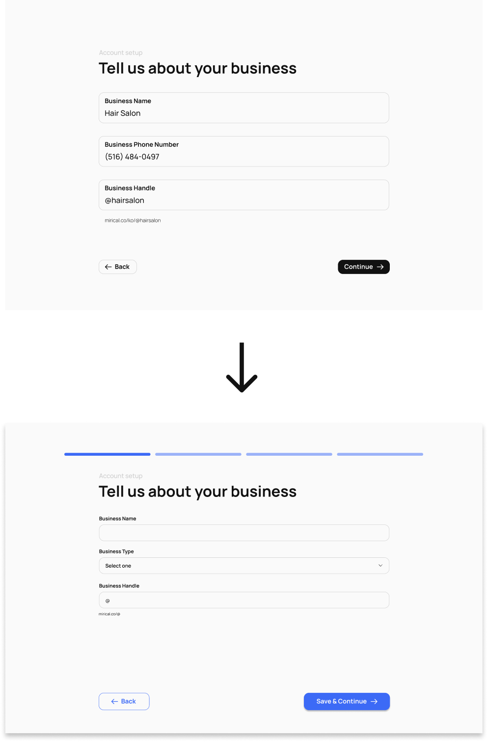
Quantified Progress Tracking
- Anchored the flow with a segmented progress bar, using opacity states to visually map the user's journey without relying on text.
- Replaced generic labels with explicit action buttons (e.g., "Save & Continue") to provide constant reassurance that data is securely captured.
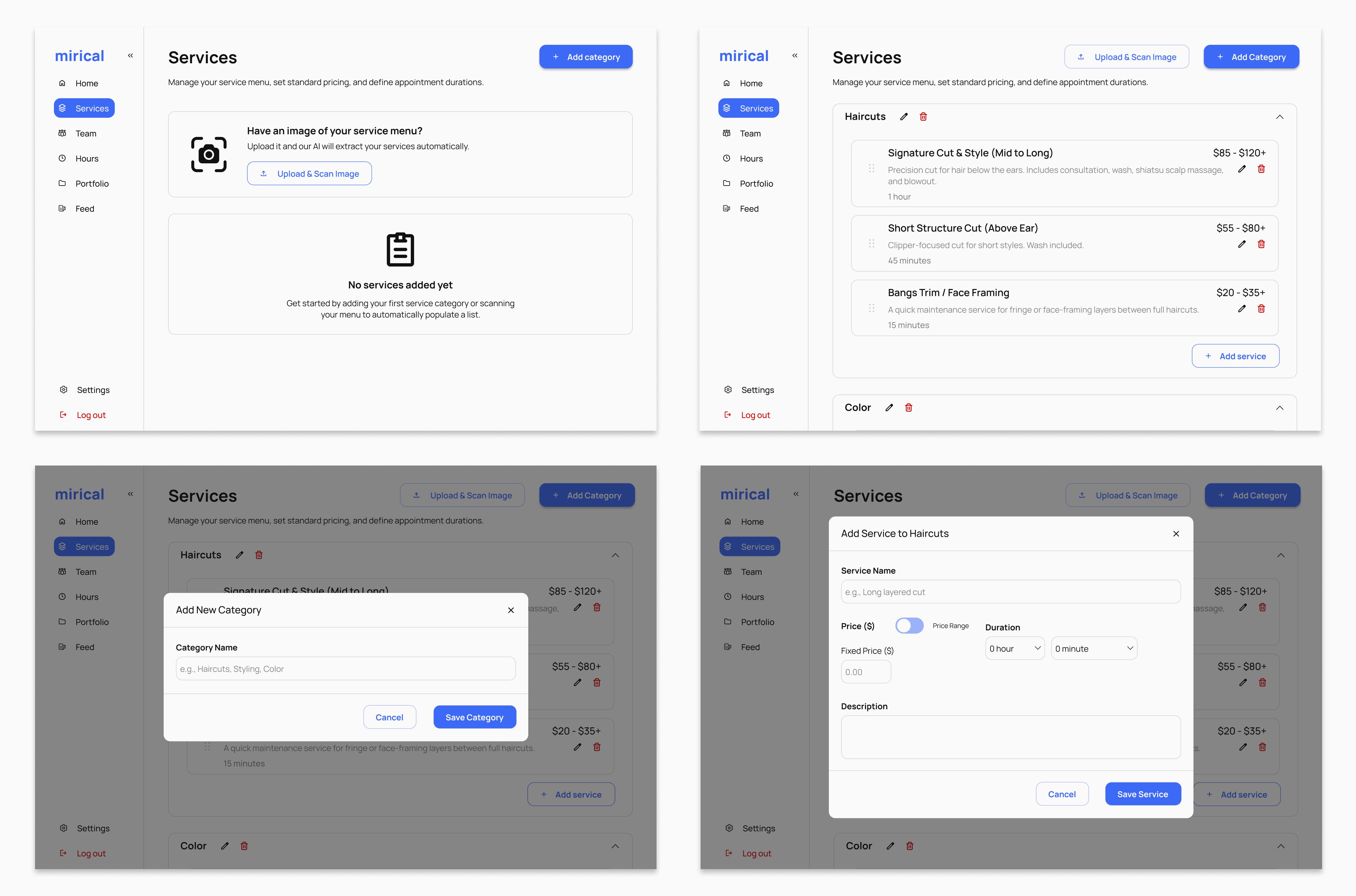
The shipped product.
Looking back & ahead.
While I loved working on this project, it came with real-world technical constraints that I don't usually face in solo concepts. For example, the calendar integration was technically complex on the backend, which meant I had limited control over the visual styling of the scheduling views. Having to adapt my design to fit these engineering realities was a valuable lesson in the compromise between design vision and development bandwidth, making this a far more realistic and effective learning experience.
Building this product from the ground up brought its own set of pressures. Seeing the dedication my brother poured into the backend motivated me to match that enthusiasm on the design side. Although the UI will inevitably evolve as the product matures, I am satisfied that the core user experience we shipped provides a successful, functional baseline for early users.
In the future, I would like to work on:
- Designing a logo.
- Improving the main business profile / booking page (adding tabs for each service type to minimize scrolling).
- Observing service business owners interacting with the app and iterating based on their feedback.