CONTEXT
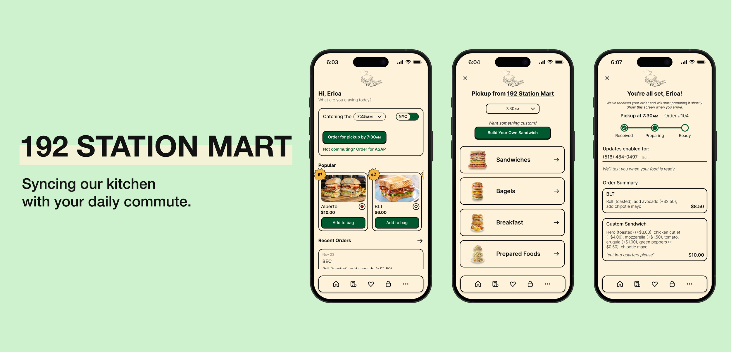
192 Station Mart is a high-traffic bodega in Auburndale, NY, owned and operated by my parents. Situated directly beside the Long Island Rail Road (LIRR) station, the store is a critical pitstop for morning commuters.
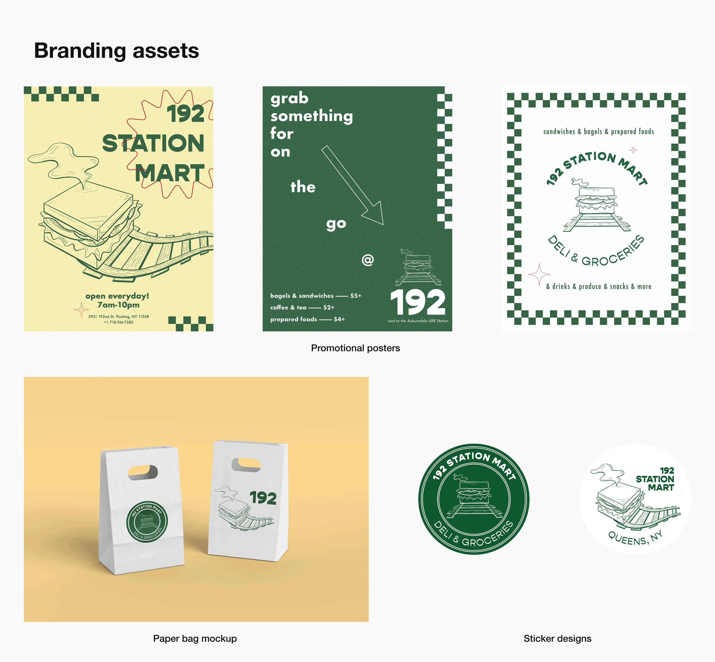
After establishing a modern brand identity through a new logo, posters, and posters, and marketing mockups, I sought to extend this transformation into the customer experience. This led to the design of a mobile pickup app, utilizing the new visual language to solve operational bottlenecks.
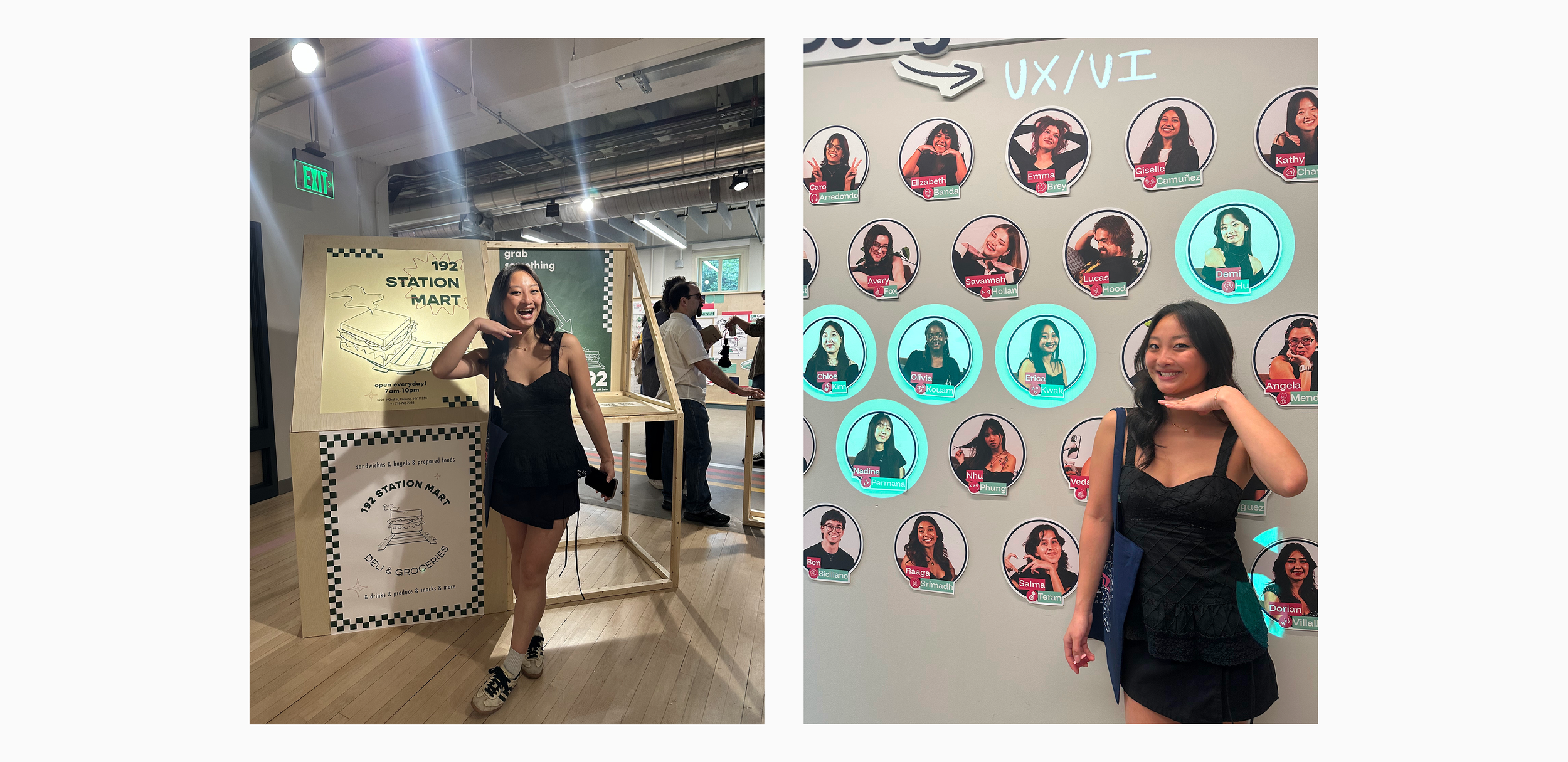
I presented this project at my senior capstone exhibition. In the weeks leading up to the event, I revisited the work to further refine the designs.
Role: Solo personal project
Timeline: 6 weeks
Tools: Figma, Illustrator, Photoshop, Fresco, Procreate
PROBLEM
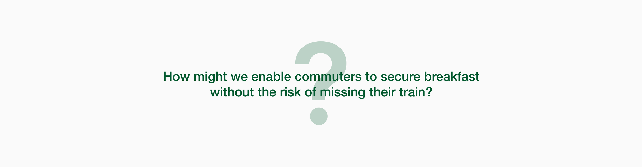
Commuters are forced to choose between their breakfast and their train.
Discussions with my mom highlighted a major pain point: she constantly sees customers abandon their breakfast mid-prep when they realize they are cutting it too close to the train time. This forces commuters into a high-stakes gamble, creating a stressful ultimatum between securing their meal or catching their ride. The result is wasted food for the business and a hungry, frustrated commute for the user.
SOLUTIONS
WHITE PAPER RESEARCH
The psychology of waiting
I conducted research on the topics of queuing theory and consumer behavior to understand why commuters were abandoning their orders. I found that the root cause wasn't the actual wait time, but the perceived risk.
Uncertainty magnifies time: According to David Maister’s The Psychology of Waiting Lines, "anxiety makes waits seem longer," and "uncertain waits are longer than known, finite waits" (Maister, 1985).
The 36% distortion: M.I.T. operations researcher Richard Larson found that people overestimate undefined waits by approx. 36% (Stone, 2012).
The Impact: A standard 10-minute wait feels like 14 minutes to an anxious user. This false perception pushes them past their "breaking point," forcing them to abandon the queue.

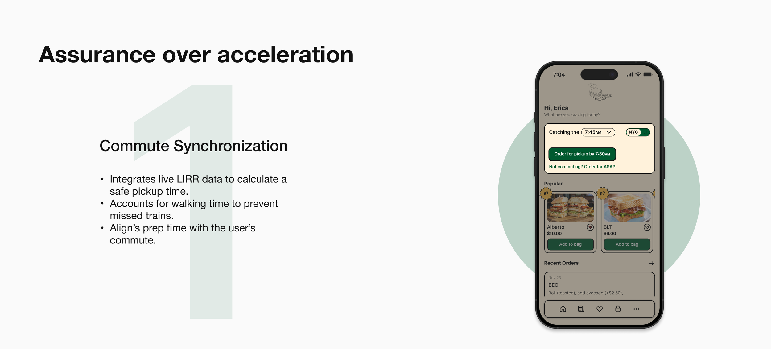
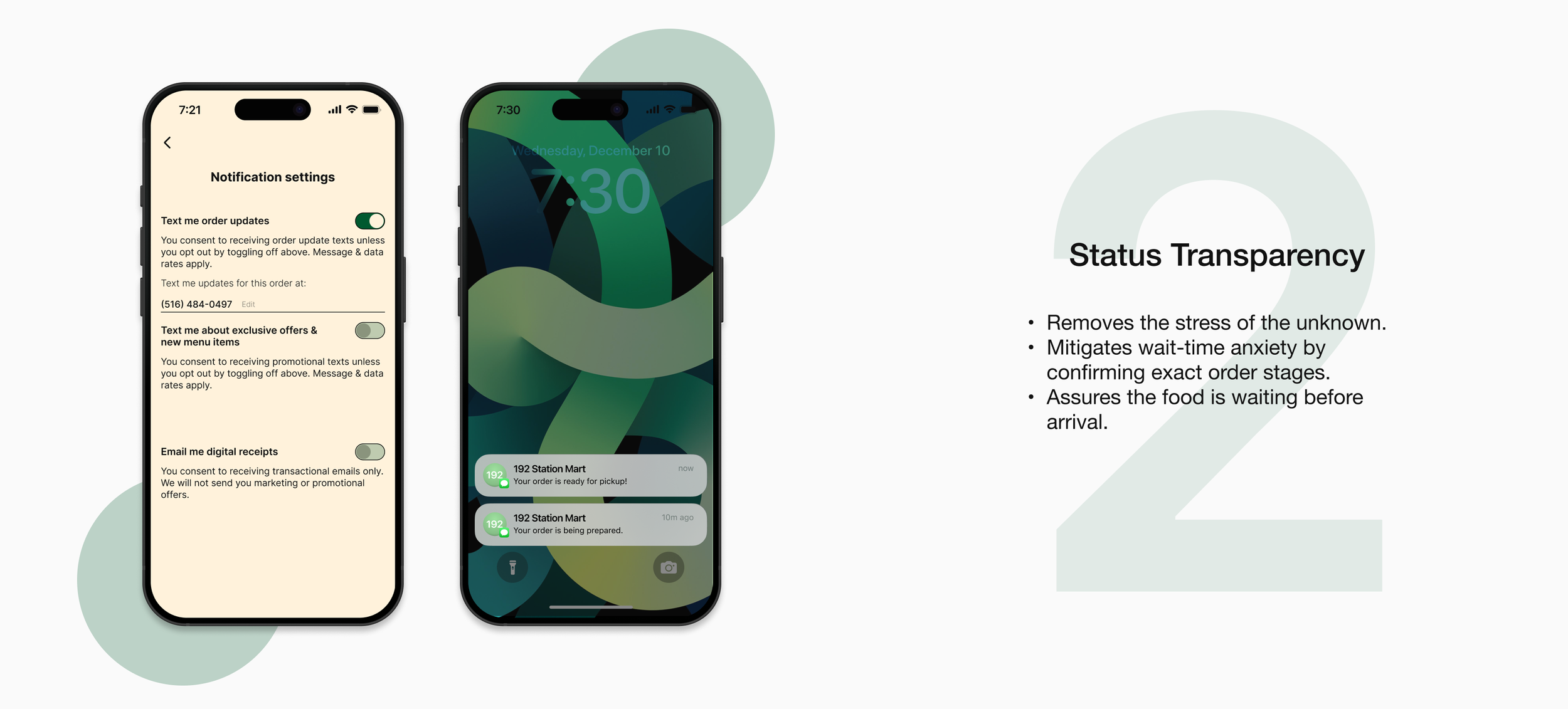
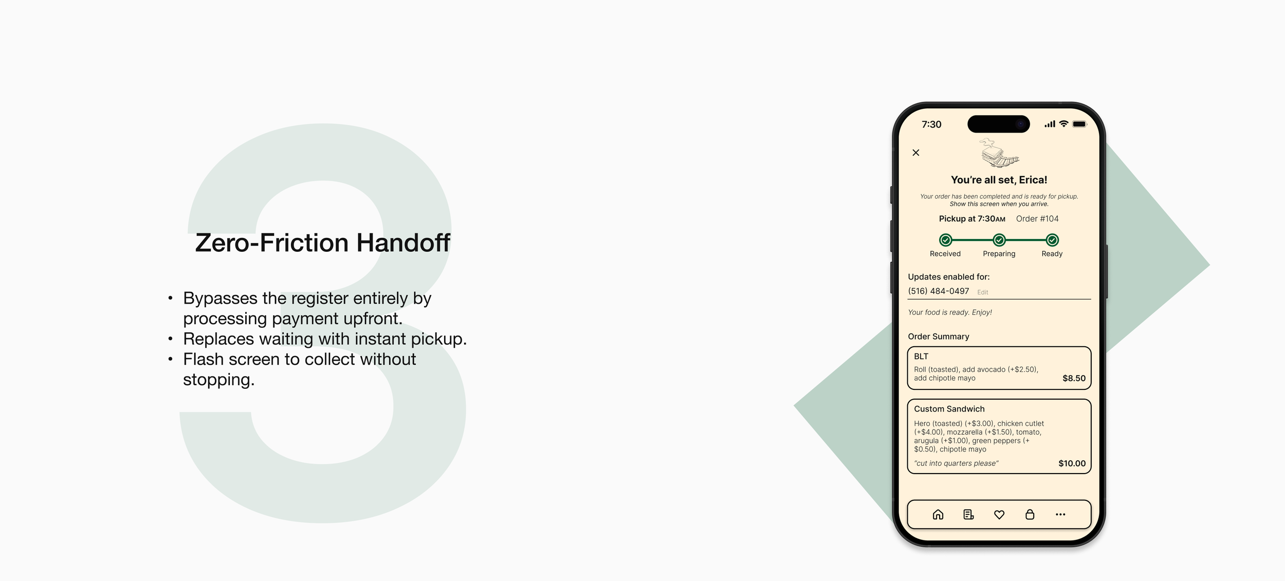
Design Implication: The solution cannot just be "faster food"; it must be "predictable food." The system must replace uncertainty with transparency.
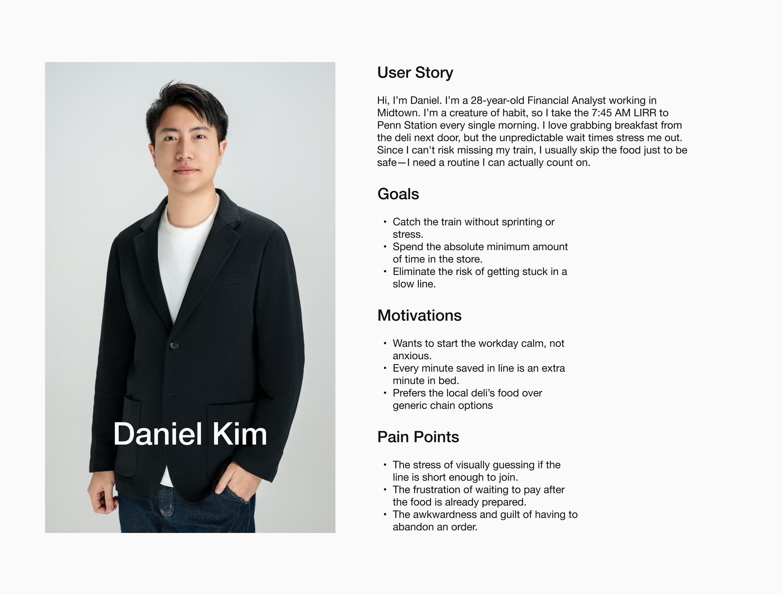
THE MORNING COMMUTER PERSONA
I consolidated my findings on user habits and the morning rush into a persona that embodies a regular customer at 192 Station Mart. This helped anchor my design decisions in real behaviors—specifically the tension between the desire for routine and the fear of missing the train.
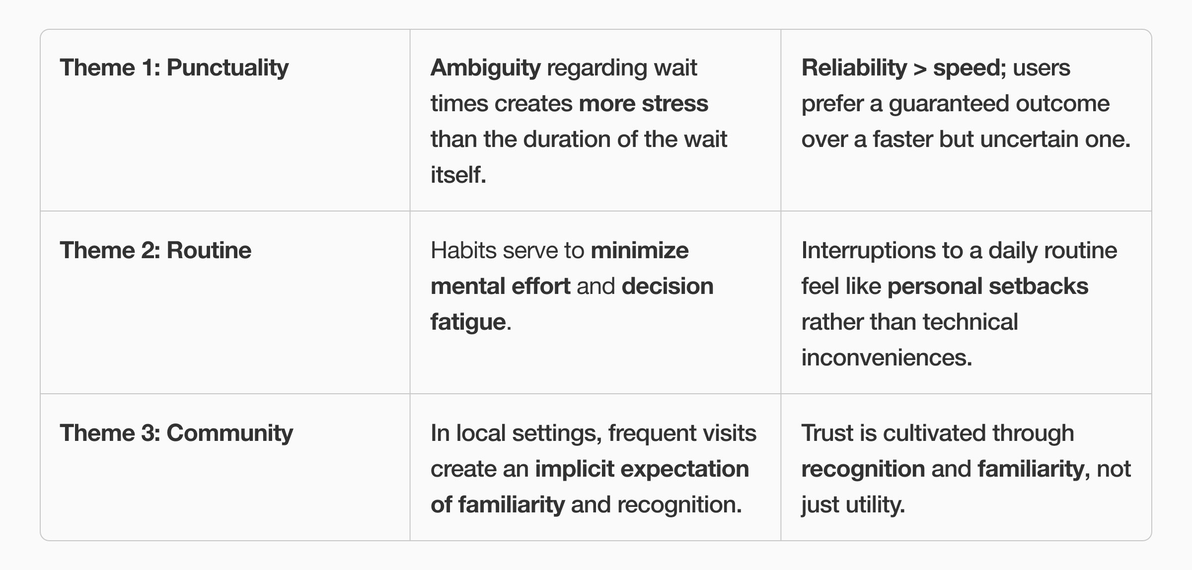
MAJOR INSIGHTS
To move from empathy to strategy, I synthesized my research insights and persona behaviors into three themes that define the commuter’s relationship with the store.
IDEATION & EXPLORATION
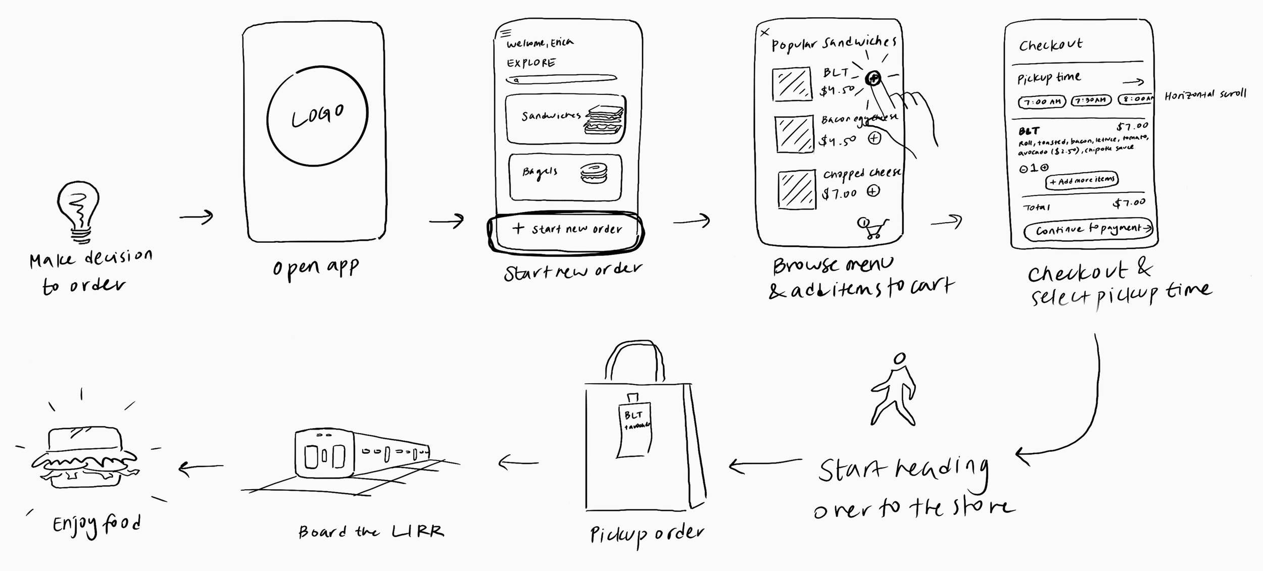
I first started off with sketching a basic user journey map displaying some of the key actions.
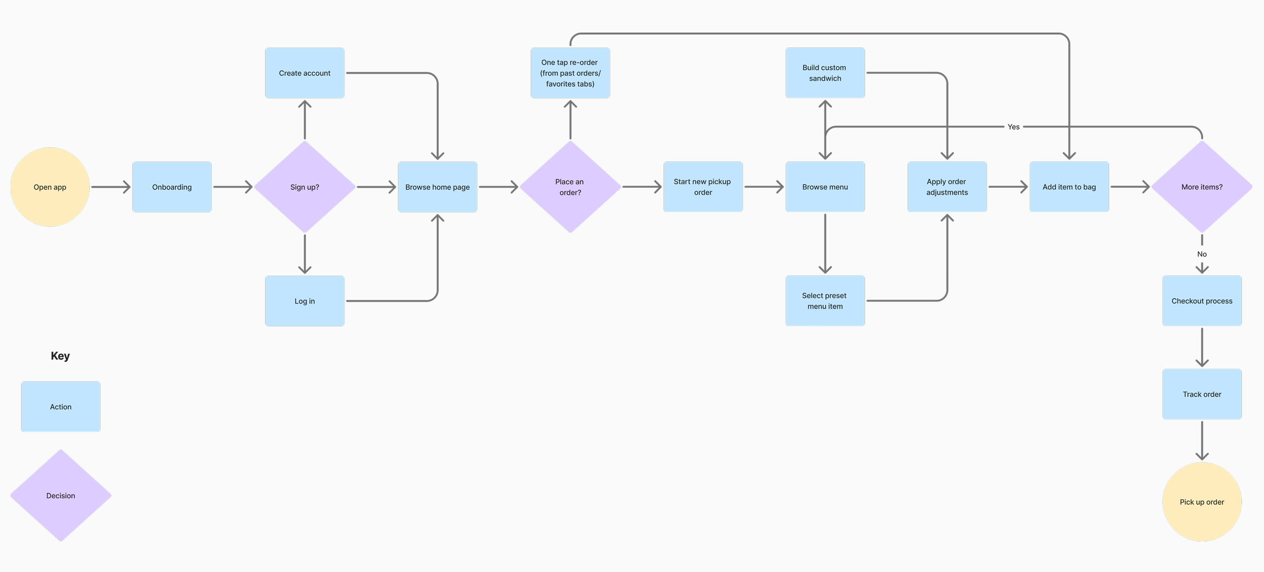
I then expanded the user flow into a more detailed diagram to better visualize the app's logic.
USER TESTING & FEEDBACK
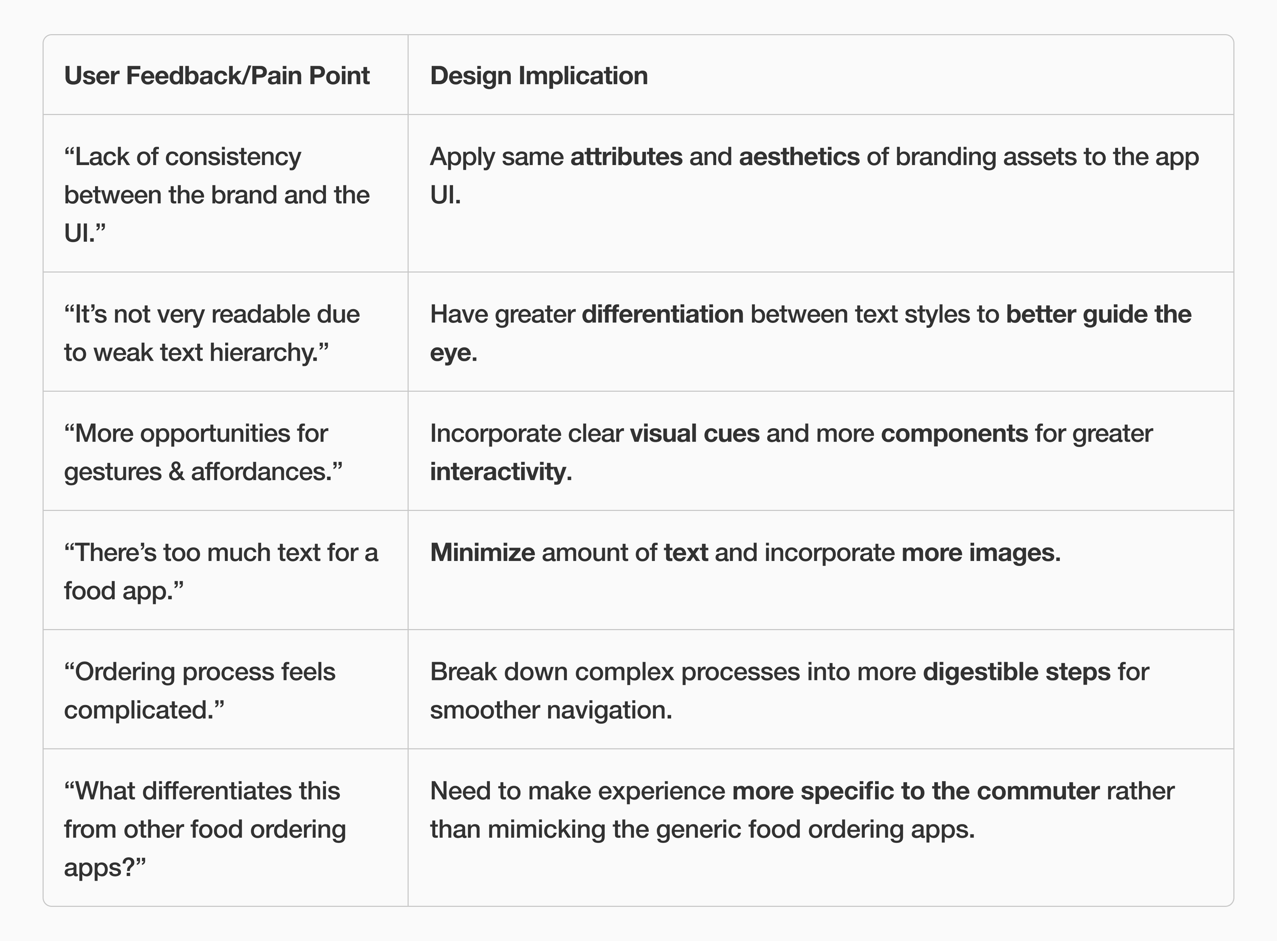
After presenting the initial prototype, I compiled the feedback from peers and professors, along with the corresponding design implications, in the table below.
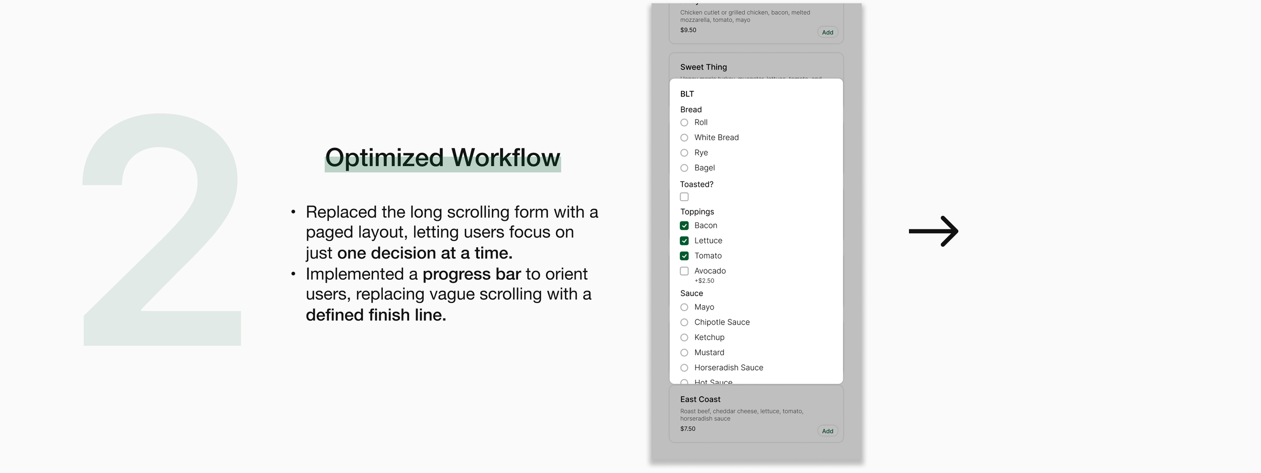
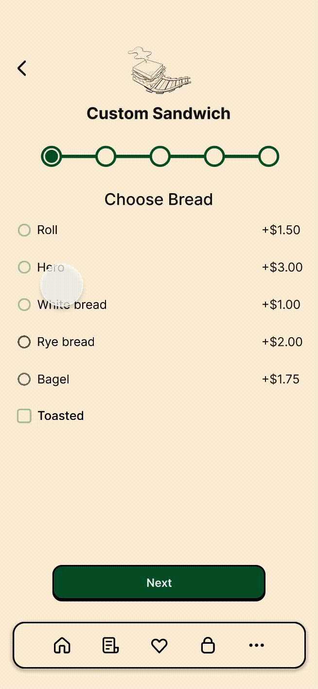
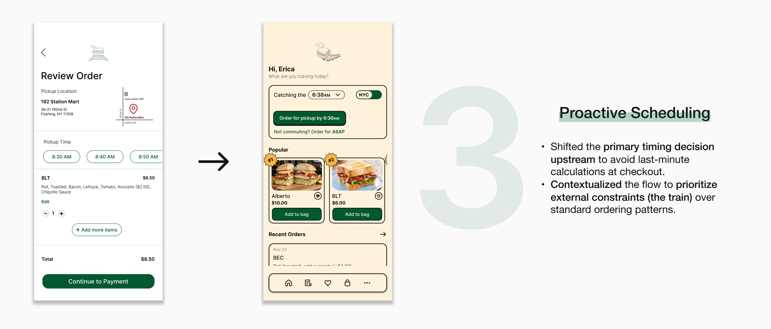
ITERATION
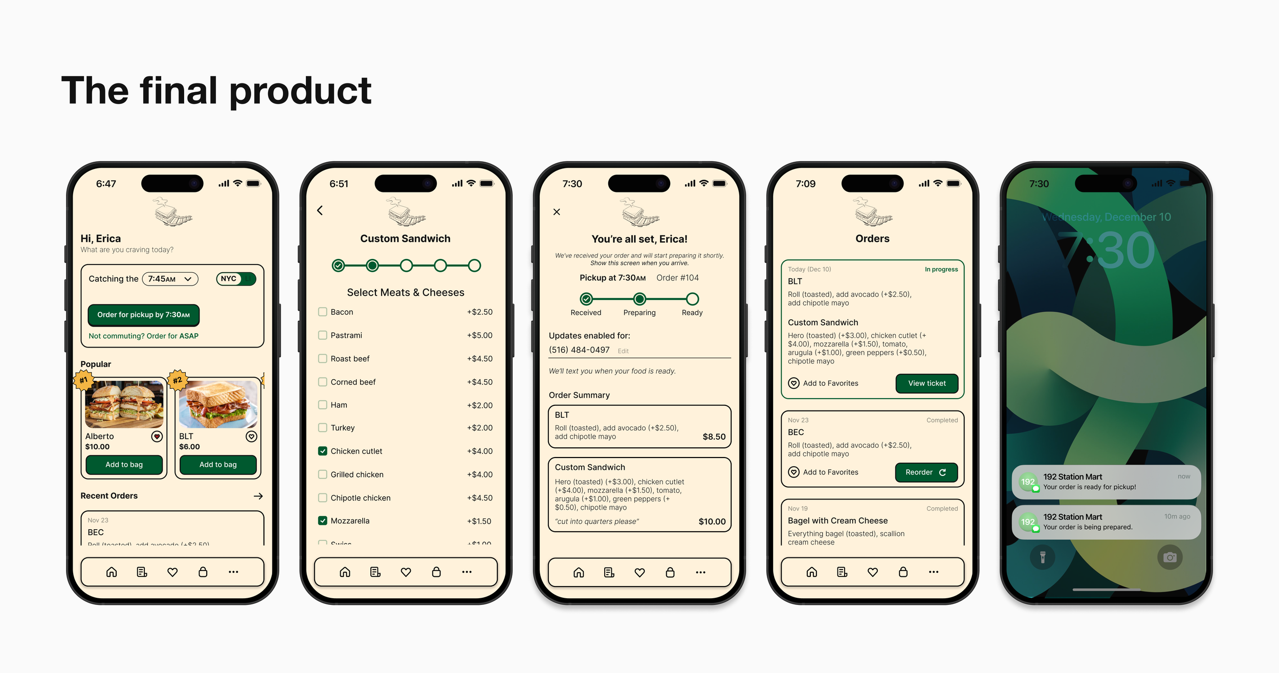
THE FINAL DESIGNS
And if you’re curious…
REFLECTIONS
What I’d do differently next time
Include an additional tab on the bottom nav bar that displays the entire menu
The only way to view all the menu items is after pressing the “Order for pickup” button.
Add coffee and other beverages
The self-serve coffees are a hot commodity in the mornings, but I forgot to include this in the menu
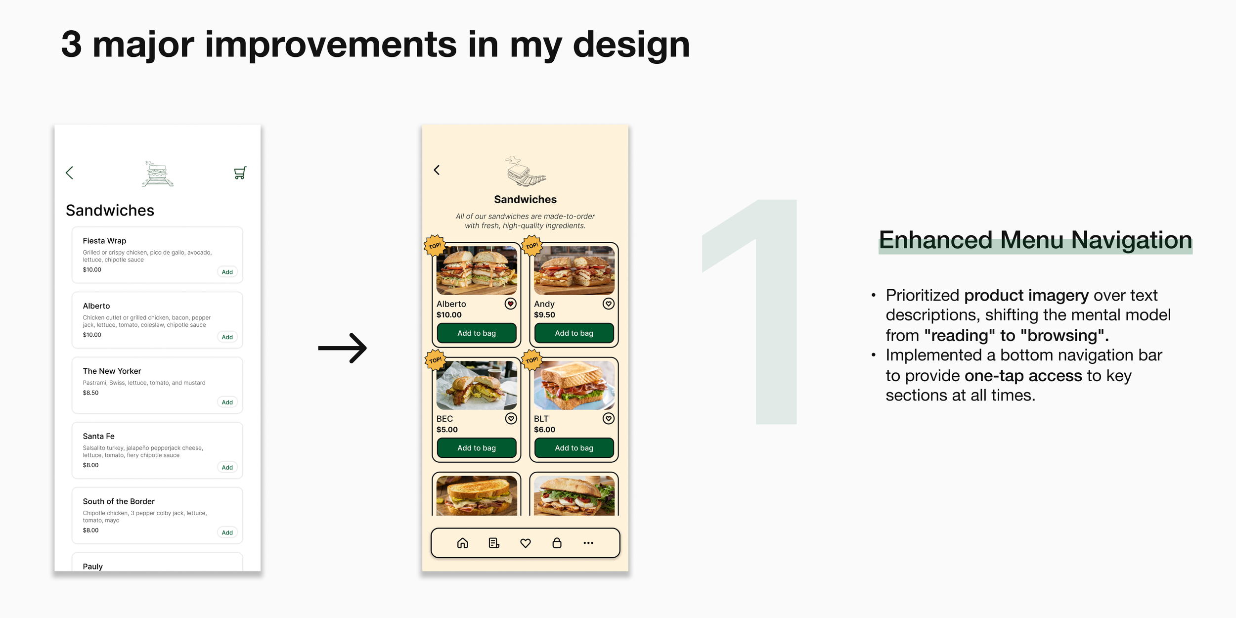
Format the “Bagels,” “Breakfast,” and “Prepared Foods” sections like the “Sandwiches” one → grid-like and more emphasis on the images
I decided against this initially because I wanted to highlight the sandwiches (since they are the most popular), but now I’m frustrated by the inconsistency.